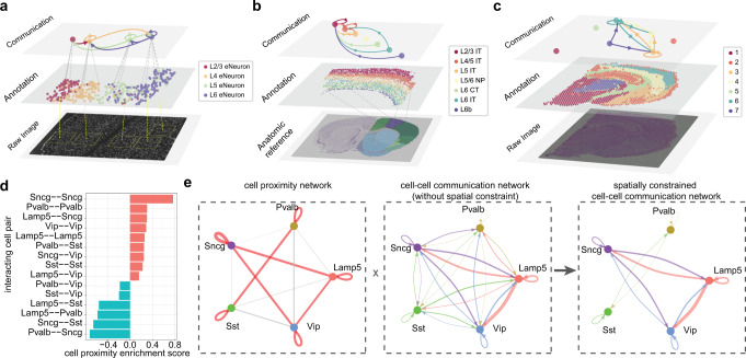
Fig. 7. Multi-layered visualization for spatial data and inference of spatially constrained communication network.
a–c Multi-layered visualization for three spatial transcriptomics datasets generated by different techniques seqFISH+ (a), MERFISH (b), and Visium (c). Each plot includes the raw tissue slice image/anatomic reference (bottom), cell/spot annotation in space (middle), and the aggregated communication network with the top 10 links shown (top). The width of a link indicates the sum of communication strengths over all significant ligand-target pairs. See Supplementary Fig. 12 for the full aggregated networks. The bottom image in (b) is the brain anatomic reference (Allen Mouse Brain Atlas, mouse.brain-map.org56 and Allen Reference Atlas atlas.brain-map.org57). d Bar plot showing the cell proximity enrichment scores for all pairwise interacting cell types. The cell proximity enrichment scores are calculated based on all 64 MERFISH slices. The score>0 (bars in red) and score<0 (bars in cyan) represent enriched and depleted proximity between interacting cell types, respectively. e The inference of spatially constrained communication network for GABAergic neurons. Left panel: the cell proximity network. Links in red or gray represent enriched or depleted proximity between interacting cell types, respectively; the width of a link indicates the strength of enrichment or depletion. Middle panel: cell-cell communication network without spatial constraint, calculated based on scRNA-seq data26 for the same brain region and same cell types (2,044 single cells in total). The width of a link indicates the sum of communication strengths over all significant ligand-target pairs. Right panel: the spatially constrained cell–cell communication network, obtained by removing links with depleted proximity from the original cell-cell communication network. See also Supplementary Fig. 13.

