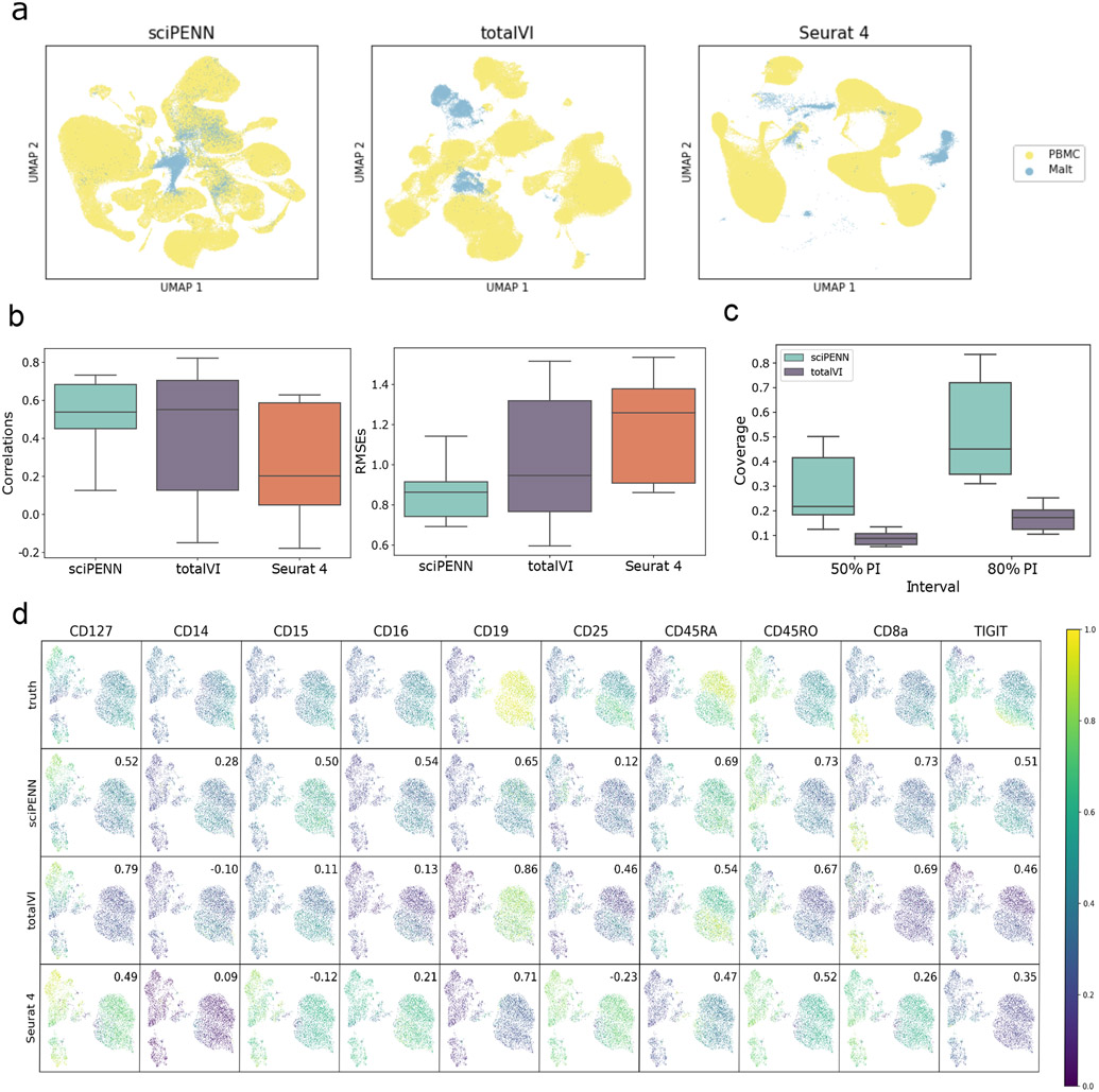
Fig. 2 ∣. Protein expression prediction in the MALT dataset using the Seurat 4 PBMC dataset as reference.
a, UMAP Embeddings visualizing the integrated hidden representation of the data, for each method. Each cell is colored according to the dataset from which it was sequenced. b, Box plots that display the correlation (left) and the RMSE (right) between each MALT protein’s predicted and true values for each method. The lower and upper hinges correspond to the first and third quartiles, and the center refers to the median value. The upper (lower) whiskers extend from the hinge to the largest (smallest) value no further (at most) than 1.5 × interquartile range from the hinge. Results are based on the analysis of 8,412 cells in the MALT dataset and 161,764 cells in the Seurat 4 PBMC dataset. c, Box plots that visualize the empirical test coverage of nominal 50% and 80% PIs per protein computed with sciPENN and totalVI. The lower and upper hinges correspond to the first and third quartiles, and the center refers to the median value. The upper (lower) whiskers extend from the hinge to the largest (smallest) value no further (at most) than 1.5 × interquartile range from the hinge. Results are based on the analysis of 8,412 cells in the MALT dataset and 161,764 cells in the Seurat 4 PBMC dataset. d, Feature plots for every MALT protein. The scatterplot is a UMAP representation of the true protein counts for the MALT data. In each feature plot, we color each cell in the scatterplot according to the intensity of its relative value for the specified protein. In the first row, we use the true values to guide the feature plot color mapping. In the subsequent rows, we color each cell according to the protein’s predicted expression, as predicted by sciPENN, totalVI, and Seurat 4. The number in the top right in each plot is the correlation between the gold standard (true) protein expression counts and the predicted counts.

