
Figure 2.
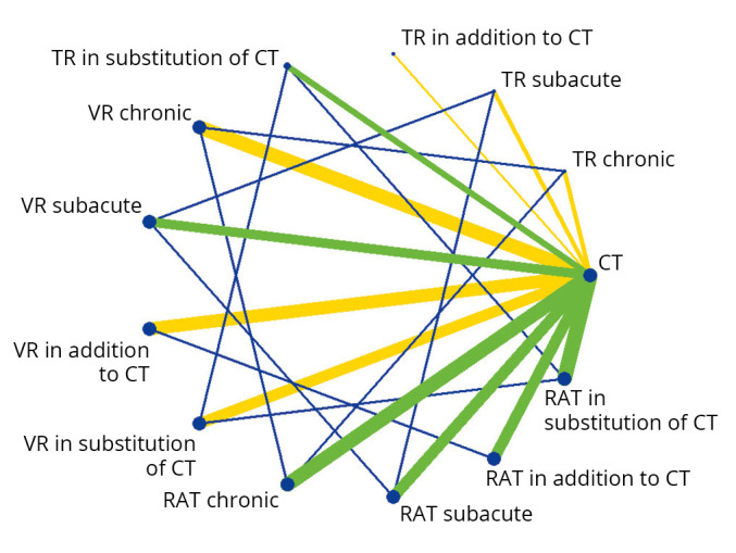
—Network diagram representing the direct and indirect comparisons between new technologies and conventional therapy regarding post-stroke upper limb motor function. Each node represents an intervention. The green and yellow lines (online version), connecting two nodes, represent direct comparisons. The thickness of the lines is proportional to the number of RCTs taken into account in the comparison. The green line (online version) represents low global risk of bias, while the yellow lines represent moderate risk of bias. The blue lines (online version), connecting two nodes, represent indirect comparisons.