
Figure 2.
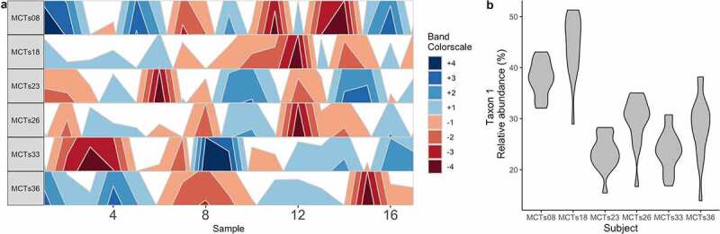
Stability and reproducibility of the microbiome. (A) A horizon plot shows how a taxon’s abundance does not change in consistent ways across time points between individual subjects. Band colors represent quartiles relative to the median. (B) A violin plot depicts the mean ± SD relative abundance of a single taxon in each individual subject, highlighting that stability is personalized. These data are from the demonstration data set from the BiomeHorizon package.47