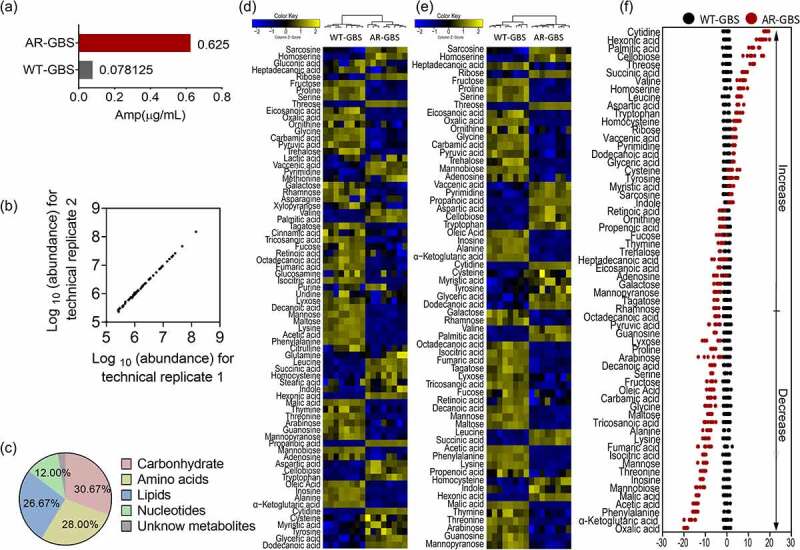
Figure 1.

Metabolomic analysis of WT-GBS and AR-GBS (a) MIC between WT-GBS and AR-GBS. (b) Reproducibility of metabolomic data. (c) Categories of identified differential metabolites. (d) Heat map showing relative abundances of metabolites in AR-GBS and WT-GBS. Yellow and blue indicate increased and decreased metabolite levels relative to the median metabolite level, respectively (see the colour scale). (e) Heatmap showing relative abundances of differential metabolites between AR-GBS and WT-GBS. Yellow and blue indicate increased and decreased metabolite levels relative to the median metabolite level, respectively (see the colour scale). (f) Z-score plots (e). The data from AR-GBS are separately scaled to the mean and standard deviation of WT-GBS. Each point represents replicate and colour indicating sample type. Black and Red represent WT-GBS and AR-GBS, respectively.
