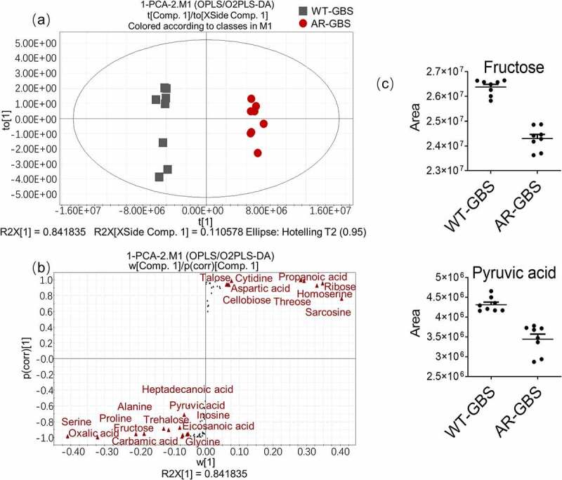
Figure 4.

Multivariate analysis of metabolomic data (a) PCA score plot. Each dot corresponds to an individual sample. Black and Red represent WT-GBS and AR-GBS respectively. (b) S-plot. Each circle represents individual metabolite, which is greater or equal to 0.05 and 0.5 for the absolute value of covariance p and correlation p(corr) respectively. (c) Scatter plot showing the relative abundance of fructose and pyruvate from data (b).
