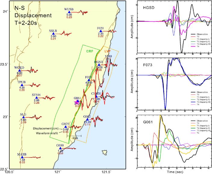
Figure 4.
Comparison of the mainshock local observed and synthetic displacement waveforms in the north–south component. The black lines are observations and the red lines are synthetics. All the waveforms are bandpass filtered at 0.05 and 0.5 Hz. The blue and red numbers beneath each seismic station are the maximum amplitude (cm) and waveform misfit, respectively. The maximum amplitude is taken from the maximum absolute value of the whole waveform. The right panels show the contribution of five different time periods in the moment rate function (Fig. 3) to the near-field strong ground motion waveforms. The map was generated by the GMT v.4.3.1 (https://www.generic-mapping-tools.org/).

