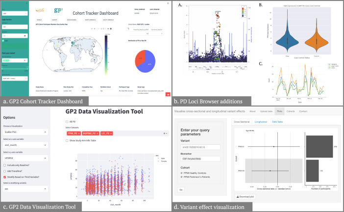
Fig. 4. Results from the data visualization projects.
a The left banner allows for filtering and specific cohort selection, the map depicts cohort origin, and the right panel depicts PD vs. non-PD distribution. b (A) Locus zoom plot generated using conditional analysis statistics for locus 78 PD risk variant rs2248244. (B) Violin plot of GBA expression in AMP PD cases and controls. (C) Example plot of browser user visits over time. c Depicts an example image from the app, in this case, a scatter plot visualization of UPDRS2 scores across visits, color-coded for sex. d On the left, users can input their query parameters, including variant, biomarker(s), and cohort(s) of interest. On the right, a forest plot demonstrates the regression beta for the variant of interest in cross-sectional data. A bar plot demonstrates the number of participants in each cohort. The exact visualization is also available for longitudinal data, with all available data available in a tabular format in the “Data Table” tab.

