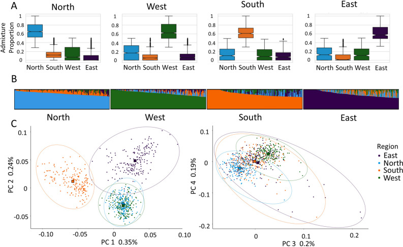
Figure 2.
Regional assignment analysis for the participant data, (A) the distribution of admixture proportions for all samples assigned to the specific region based on their maximum ancestry proportion (n = 3814), (B) supervised ancestry proportions for the randomly selected participants (n = 186 per region) in each region above the median (observed in (A)) where each bar is an individual’s ancestry proportions depicted by the color that total 100% and plotted with CLUMPAK52, (C) genetic principal components 1–4 of the four regions (n = 744), including an ellipse53 estimated with the Khachiyan algorithm to depict the enclosed cluster. The square shapes represent the mean combination of both PCs for each region.

