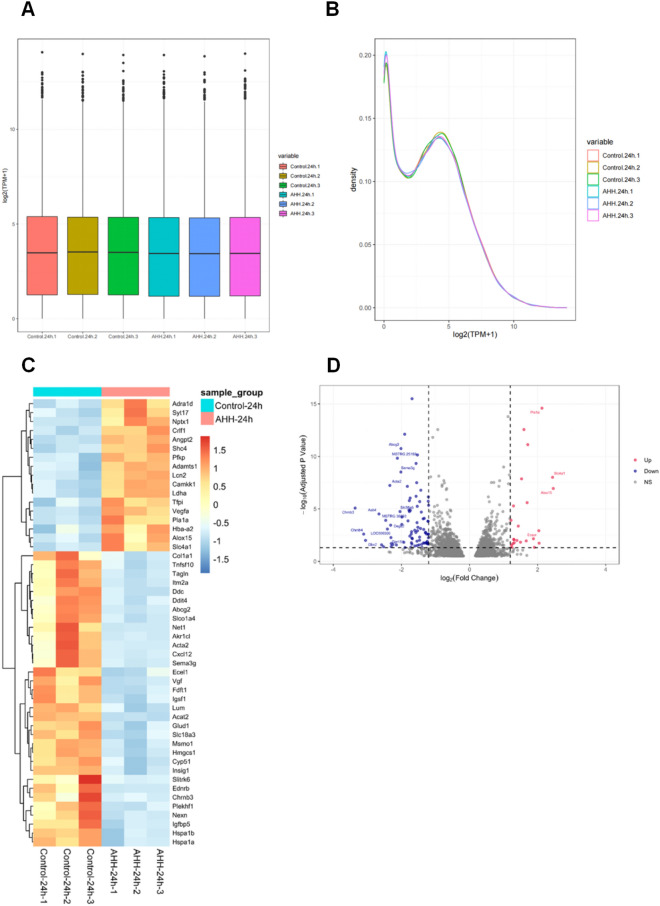
Figure 1.
(A) Box plot of log2 (TPM + 1) expression values for each sample. The horizontal coordinates in the plot represent the different samples; the vertical coordinates indicate the expression level of the sample log2 (TPM + 1) values. The plot indicates the expression level of each sample in terms of the overall dispersion of expression. Box line plots for each region correspond to six statistical parameters (upper, outlier, upper quartile, median, lower quartile, and lower limit from top to bottom). (B) Density plot of the distribution of log2 (TPM + 1) values for each sample. Different colored curves in the graph represent different samples; the horizontal coordinates of the points on the curves indicate the log values of TPM + 1 for the corresponding samples, and the vertical coordinates of the points indicate the probability density. (C) Heatmap analysis of 112 differentially expressed genes (DEGs) in the two groups: control-24 h and acute hypobaric hypoxia (AHH)-24 h groups. All genes shown are significantly differentially expressed between the two groups (adjusted p < 0.05). Colored bars from blue to red represent the increasing levels of gene expression from low to high. (D) Volcano plot analysis of 112 DEGs in the control-24 h and AHH-24 h groups. Each dot represents a gene that was detected in both groups. Red and blue dots indicate genes with significantly up and downregulated expression, respectively. Gray dots show genes that were not significantly differentially expressed between the control-24 h and AHH-24 h groups. The horizontal axis indicates the log ratio (changes in gene expression ploidy across samples), and the vertical axis indicates the probability of differential expression of each gene. The DEGs were identified using a false discovery rate of 0.05.

