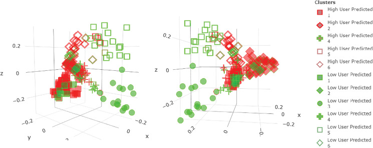
Fig. 2.
3D MDS plot of Random Forest's proximity matrix; each dot represents a farm and the distance between the dots represents dissimilarity (the further away the more different). The shape of the dots represents the different clusters, the inner colour displays the real AMU class and the outer stroke colour represents the predicted AMU class (in both cases red represents High user and green Low user; if the image is shown in B&W, red is more intense.

