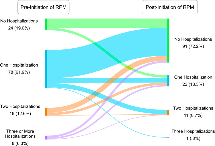
Figure 4.
Sankey graph where colored bins on the left represent groups of patients who experienced 0, 1, 2, or 3+ all-cause hospitalizations pre-initiation of RPM. The ribbons represent the flow of those patients to a bin representing the number of hospitalizations they experienced in the 12 months post-initiation. The numbers indicate numbers of patients in that subgroup.

