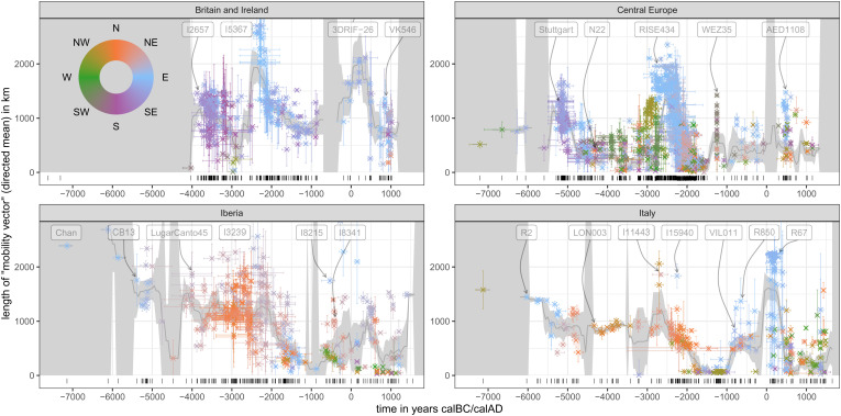
Fig. 5.
Mobility estimation results. Scatter plots for four analysis regions (Fig. 1). The position on the x-axis gives the median ages of the samples in years calBC/AD. The y-axis and color reflect length and direction of the mean mobility vector of each sample (the vector pointing from the burial location to the point of maximum genetic similarity). Each dot represents the mean vector for one sample across 25 temporal resampling runs that reflect the age uncertainties of the input samples. Each observation comes with error bars on the x- and y-axis. On the x-axis, these cover the limits of the 2-sigma range of the age probability distribution; on the y-axis, they show one standard deviation of the age resampling distribution. The smooth gray curve printed below the samples is a 400-y moving mean for the spatial distance. It is calculated from the total set of the resampled iterations. The dark gray ribbon accommodating this mean curve is two times the standard error of the mean based on the mean dots displayed here. It is visualized as infinite if a given 400-y time window has less than two samples. The barcode plot at the bottom of each subplot documents the diachronic data coverage for each region. Only samples with a median age between 7300BC and 1500AD were considered for this analysis. SI Appendix, Text 3.3 for a more detailed description of the algorithm behind this figure. Alternative versions are provided in SI Appendix, Figs. S10-S13.

