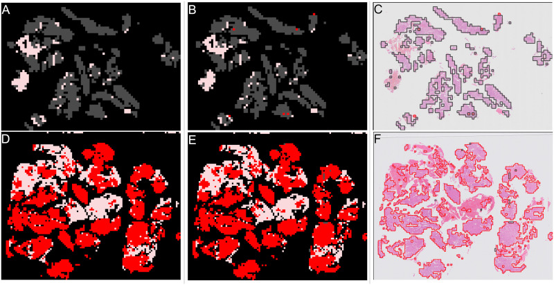
Fig 13. Examples of patch classifications for correctly predicted slides.
Top row shows an “other or benign” slide from the validation set, bottom row shows a “malignant” slide from the validation set. First column shows annotation, second column shows model results, third column is model results overlaid on slide image. Red shows “malignant” patches. Grey shows “other or benign” patches. Pink shows “blood or mucus”. (A) Annotation of “other or benign” slide. (B) Patch results of “other or benign” slide. (C) Patch results overlaid on “other or benign” slide image. (D) Annotation of “malignant” slide. (E) Patch results of “malignant” slide. (F) Patch results overlaid on “malignant” slide image.

