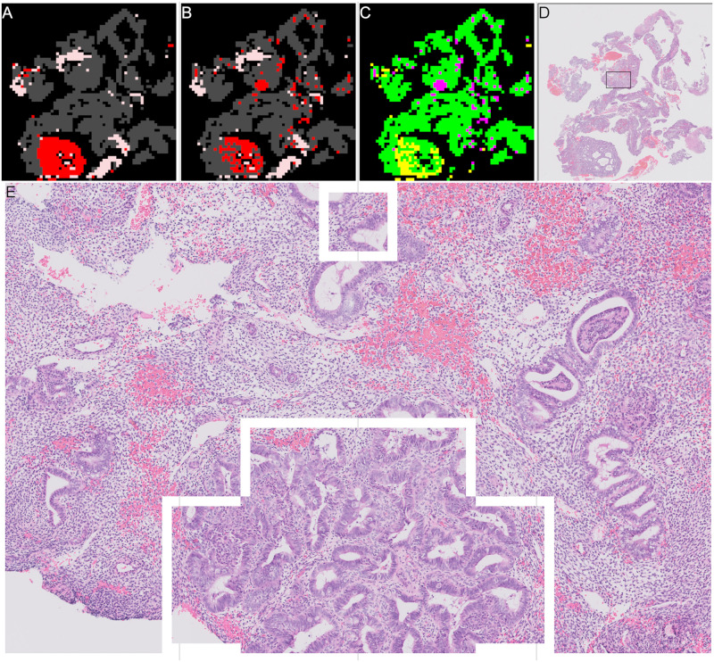
Fig 14. Example of patch classifications for correctly predicted “malignant” slide with some incorrect patches.
(A) Annotation of “malignant” slide. Red shows “malignant” patches. Grey shows “other or benign” patches. Pink shows “blood or mucus”. (B) Patch results of “malignant” slide. Red shows “malignant” patches. Grey shows “other or benign” patches. Pink shows “blood or mucus”. (C) Difference between patch results and annotation. Green, prediction correct. Yellow, prediction = “other or benign”, annotation = “malignant”. Magenta, prediction = “malignant”, annotation = “other or benign”. (D) Thumbnail of slide showing region in (E) as black box. (E) Zoomed in detail of region where patch predictions do not match annotations.

