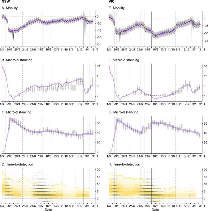
Figure 3. Time-series of each sub-model of transmission potential (Component 1) for New South Wales (NSW) and Victoria (VIC) from 1 March 2020 to 24 January 2021.
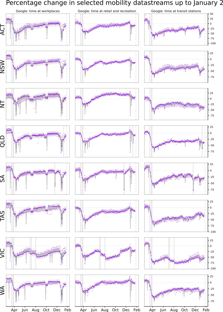
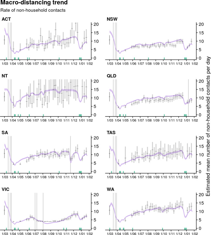
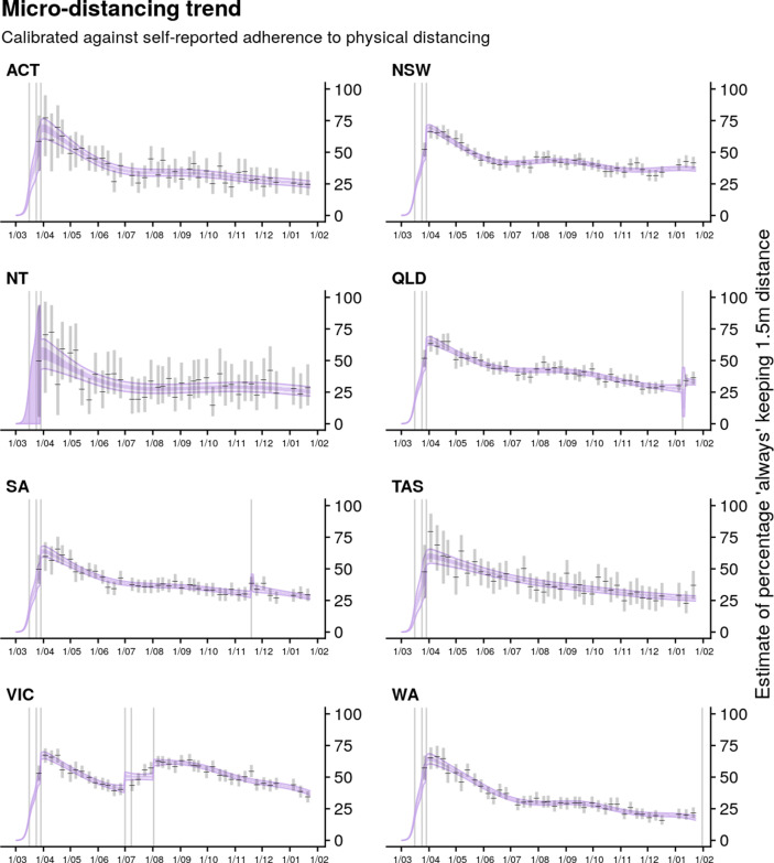
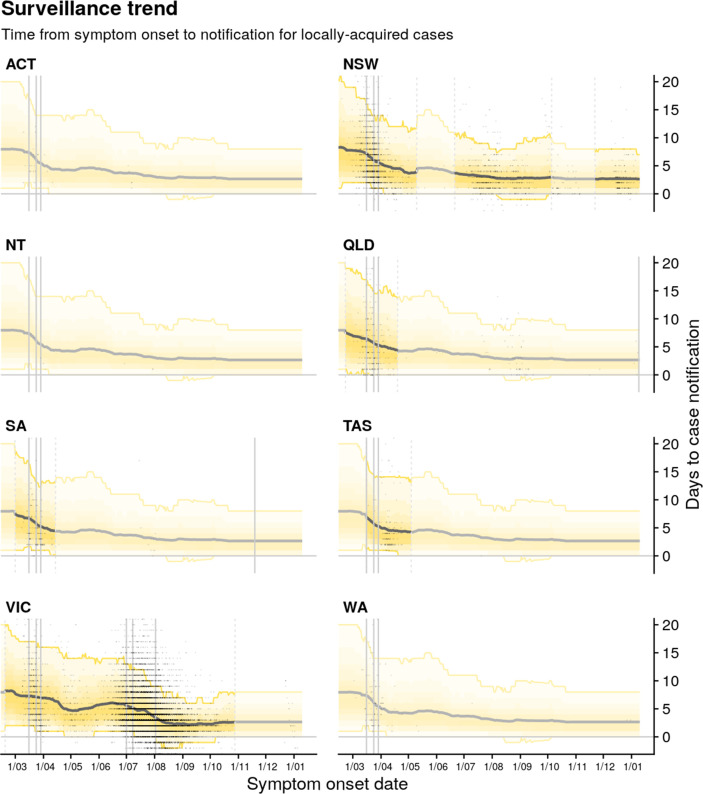
Vertical lines represent dates of key changes in restrictions on gatherings and movement, detailed in Supplementary file 1 (solid lines = tighteningof restrictions; dashed lines = easing of restrictions). The blue bar is shaded according to the level of restrictions (lighter blue = less restrictions; darker blue = more restrictions). (A and E) Percentage change compared to a pre-COVID-19 baseline of one key population mobility data stream ‘Google: time a retail and recreation’. Purple dots are data stream values (percentage change on baseline). Solid lines and grey shaded regions are the estimated trend and 95% error interval estimated by our model. (B and F) Estimated trends in macro-distancing behaviour, that is, reduction in the daily rate of non-household contacts (dark purple ribbons = 50% credible intervals; light purple ribbons = 90% credible intervals). Estimates are informed by state-level data from nationwide weekly surveys (indicated by the black lines and grey rectangles) and population mobility data. (C and G) Estimated trends in precautionary micro-behaviour, that is, reduction in transmission probability per non-household contact (dark purple ribbons = 50% credible intervals, light purple ribbons = 90% credible intervals). Estimates are informed by state-level data from nationwide weekly surveys (indicated by the black lines and grey boxes). (D and H) Estimated trend in distributions of time from symptom onset to notification for locally acquired cases (black line = median; yellow ribbons = 90% distribution quantiles; black dots = time-to-notification of each case). Faded regions indicate where a national trend is used due to low case counts.

