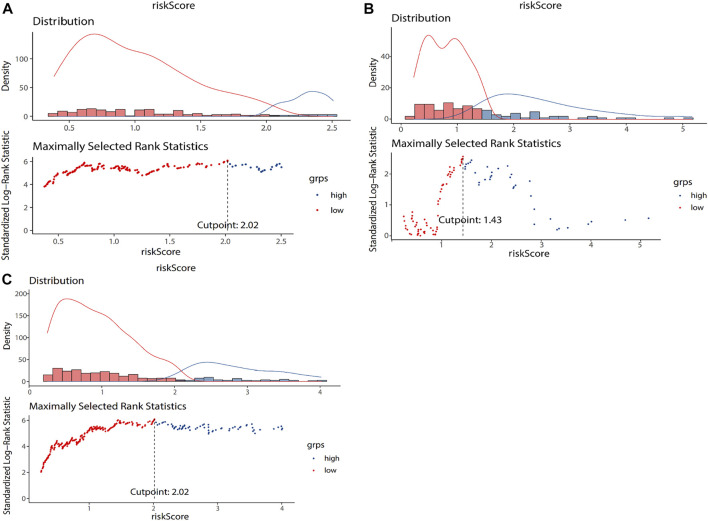
FIGURE 2.
The grouping results of training dataset (A), testing dataset (B), and entire TCGA dataset (C). The lower part of the figure is the optimal cut-off value calculated according to the maximum selection rank statistics. The risk score of the blue dot is lower than the cut-off value, which is a low-risk group. The risk score of the red dot is higher than the cut-off value, which is a high-risk group. The upper part of the figure is the data distribution histogram and density distribution curve of risk score. Blue represents low risk group, and red represents high risk group.

