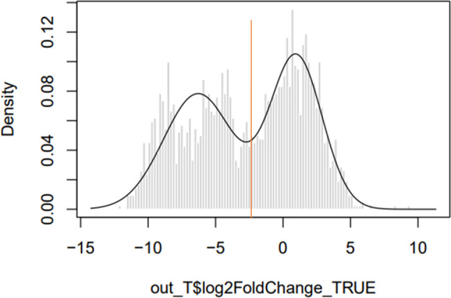
Fig. 2.

Density histogram showing the log fold change of expected vs observed insertion counts. The x-axis shows the log fold change between observed and expected datasets, and the y-axis shows the density. The left-hand peak contains genes with fewer insertions than expected, while the right-hand peak contains genes with an expected, or greater than expected number of insertion sites. The red line indicates the log2 fold change cut-off of −2.3; genes that fall on the left-hand side of this line are considered to contribute to the left-hand ‘reduced’ peak.
