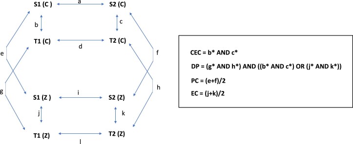
Extended Data Fig. 3. Explanatory diagram.
Diagram outlining expression contrasts between populations and treatments, and calculated metrics. Values in bold represent expression values for populations (for example, S1) and treatments (C for control, Z for zinc). Arrows with letter designations represent differences between these expression values (for example, b is the difference in expression levels for a gene in S1 and T1 in the control). The formulae outline the conditions for genes being classified as (i) CEC and (ii) DP, and how (iii) PC and (iv) EC are calculated for individual genes. In the formulae, an asterix denotes a statistically significant difference.

