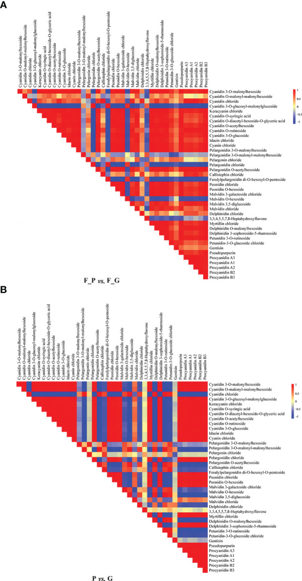
Figure 3.

Visualization of metabolite–metabolite correlations. (A) Heat map of pairwise correlations between metabolites identified in the F_P vs F_G comparison group. (B) Heat map of pairwise correlations between metabolites identified in the P vs G comparison group. Each square indicates a given r value resulting from a Pearson correlation analysis in a false color scale (red and blue indicate positive and negative correlations, respectively). The self-comparisons are indicated in white.
