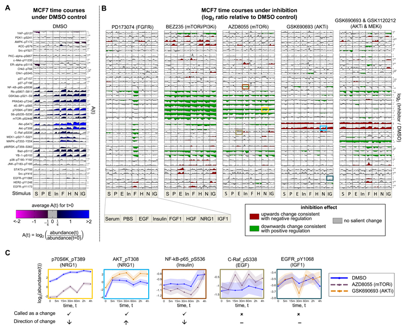
Figure 3. Phosphoprotein Time-Course Data and Context-Specific Changes Under Inhibition for Breast Cancer Cell Line MCF7.
(A) Phosphoprotein time courses under DMSO control. Rows correspond to 35 phosphoproteins (a subset of the full set of 48; see STAR Methods for details) and columns correspond to the eight stimuli. Each time course shows log2 ratios of phosphoprotein abundance relative to abundance at t = 0. Shading represents average log2 ratio for t > 0. (B) Phosphoprotein time courses under kinase inhibition. Each of the five vertical blocks corresponds to a different inhibition regime. Within each block, rows and columns are as in (A). Each time course shows log2 ratios of phosphoprotein abundance under inhibition relative to abundance under DMSO control. Shading represents direction of changes in abundance due to inhibitor: Green denotes a decrease in abundance, red denotes an increase and gray denotes no salient change (see examples in panel (C)). See STAR Methods for details of statistical analysis. For both (A) and (B), plots were generated using a modified version of the DataRail software (Saez-Rodriguez et al., 2008). Each phosphoprotein is plotted on its own scale and phosphoproteins are ordered by hierarchical clustering of all data. See Figure S1 for corresponding plots for cell lines UACC812, BT20 and BT549. (C) Selected examples from (B) showing control (DMSO) and inhibitor time courses separately; box color identifies the source cell in (B). Examples are shown for (from left to right): a clear decrease in abundance ; a clear increase in abundance; a decrease in abundance that is borderline under the criteria we use; a borderline case called negative (i.e. called as no change) and a clear negative case. Shaded region indicates time-averaged replicate standard deviation. See also Figure S2.

