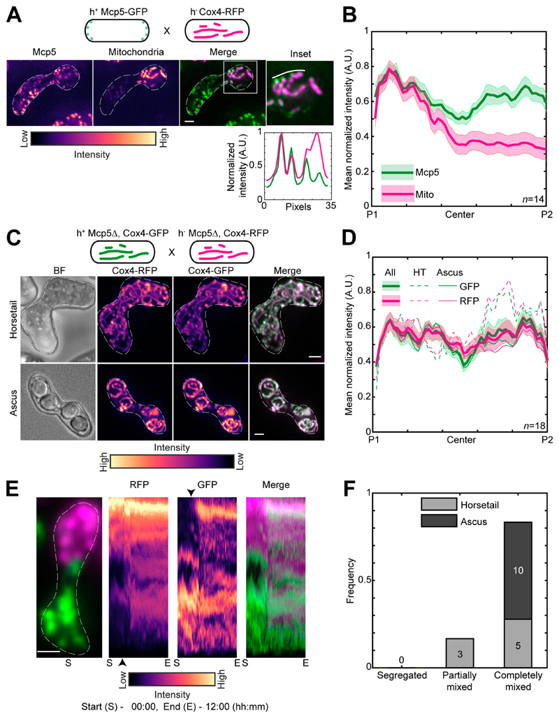
Figure 3. Mcp5 is essential for mitochondrial tethering to the cortex.
(A) Schematic of the cross performed (top, strain FY16854xPT1651; see Table S1), maximum-intensity–projected images of Mcp5 labeled with GFP (left) and mitochondria labeled with Cox4-RFP (second from left) represented in the intensity map to the bottom of the images, their merge (third from left), and the inset (right). The intensity of mitochondria (magenta) and Mcp5 (green) 2 pixels below the white line marked in the inset appears in the plot below. (B) Plot of mean normalized intensities of Mcp5 (green line) and mitochondria (magenta line) across the length of the cell from the cross indicated in A (n = 14). (C) Schematic of the cross performed (top, strain VA066xVA074; see Table S1), maximum-intensity–projected images of brightfield channel (BF; first from left), mitochondria labeled with Cox4-RFP (second from left) and mitochondria labeled with Cox4-GFP (third from left) represented in the intensity map to the bottom of the images, and their merge (right) during the early stage (horsetail, top) and late stage (ascus, bottom) of meiosis. (D) Plot of mean normalized intensities of RFP (magenta lines) and GFP (green lines) in the horsetail stage (HT; dashed lines, n=8), ascus stage (Ascus; solid lines, n= 10), and the stages combined (All; thick solid lines) across the length of the cell from the cross indicated in C (n = 18). (E) Representative maximum-intensity–projected image (left) and kymographs of time-lapse movies of RFP channel (second from left), GFP channel (third from left), and their merge (right) of meiotic cells resulting from the cross indicated in C, exhibiting the completely mixed phenotype. The intensity map of kymographs of the GFP and RFP channel is indicated to the bottom of the images. S denotes start of imaging at 00:00, and E denotes end of imaging at 12:00 (hours:minutes). The black arrowheads point to the time when mitochondria start to mix. (F) Stacked bar plot of frequency of segregated, partially mixed, and completely mixed phenotypes observed in horsetail (light gray) and ascus (dark gray) stages from the data in D. In A, C, and E, scale bars represent 2 µm and dashed lines represent cell outlines. In B and D, shaded regions represent SEM.

