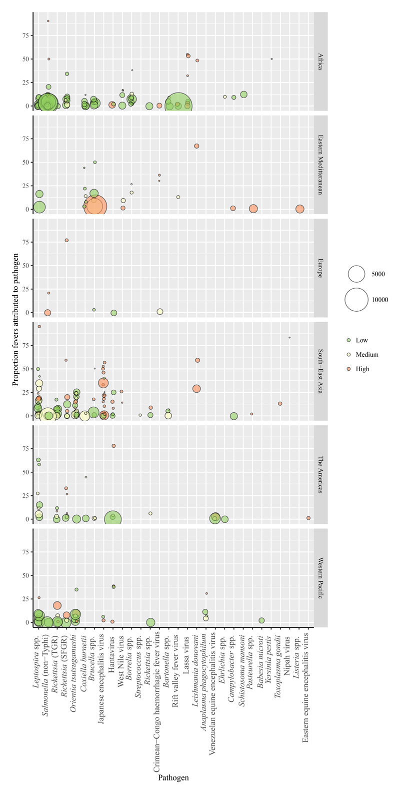
Figure 4. Proportion of fevers attributed to each zoonosis.
The plot includes one data point per study and pathogen combination. The different panels include data from different WHO regions. Point colour indicates the coding for the risk of bias for the representativeness of the febrile population and point size is proportional to the number of individuals tested. Points are jittered on the x axis and shaded to visualize overlapping points.

