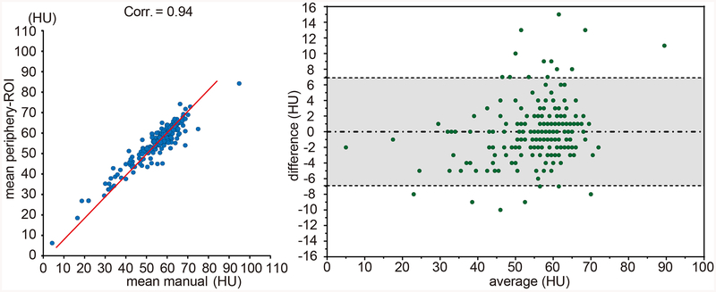
Figure 8.
The left panel shows the correlations between mean periphery-ROI and mean manual ROI. The blue dots indicate the Hounsfield Unit (HU), and the red lines are the linear regression results. The right panel shows the Bland-Altman plot between mean periphery-ROI vs. mean manual ROI. The gray area indicates the 95% confidence interval.

