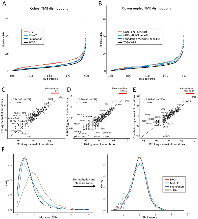
Figure 1. Comparison of tumor mutational burden (TMB) distribution and gene mutation rates across targeted panel and whole exome sequencing (WES) cohorts.
(A-B) TMB distributions (A) in the panel cohorts and (B) obtained by subsetting the WES cohort to the panel gene sets (downsampling) are higher than the WES TMB distribution. The x-axis depicts the percentile of each TMB value, the y-axis depicts TMB in mutations/megabase. 8 high outliers in (A) not shown. (C-E) Average mutation rates per gene in each panel cohort are highly correlated with average gene mutation rates in the WES cohort. Natural log average mutations per gene in (C) DFCI, (D) MSKCC, and (E) Foundation cohorts are shown on the y-axis, natural log average mutations per gene in the TCGA cohort are on the x-axis. Each point represents a gene. Dashed line depicts y = x. Pearson’s correlation coefficients are shown. (F) Normalization and standardization of TMB distributions bring the NGS and WES cohort distributions into alignment. The left panel shows the kernel density plot of unadjusted TMB values in each cohort, the right panel shows the transformed density plot of TMB z-scores demonstrating high overlap.

