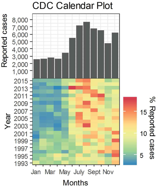
Figure 1.

Histogram and Calendar plot of legionellosis cases reported to the Centers for Disease Control and Prevention from January 1993 to December 2015. Cool to warm color scale represents a low to high scale of monthly per cent of reported cases. Low monthly percentage of yearly reported counts is represented by a dark blue tone with red symbolizing the other end of the scale.
