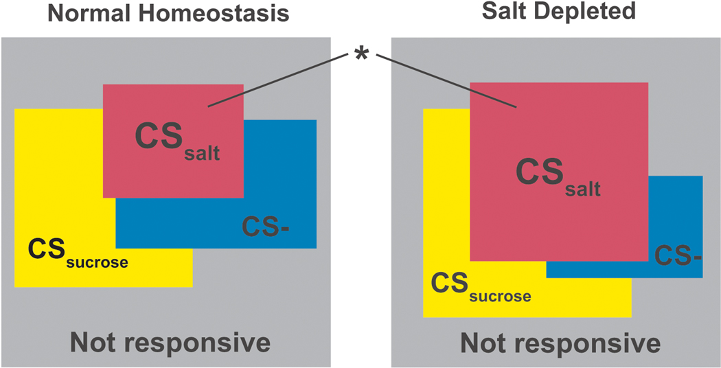
Figure 3.
Population coding during extinction testing (“CS Alone”). This “Venn style” diagram uses rectangles rather than circles to represent sizes of neural populations responsive to the different cues (CSsalt, CSsucrose, and CS−). The area of each rectangle is proportional to the population size. The grey background represents the total of all neurons tested and the area of exposed grey represents the proportion of unresponsive neurons. The overlap between rectangles indicates the intersection among populations with one, two or, three responses. For example, the overlap between red and blue rectangles represents the proportion of neurons with responses to both CSsalt AND CS−. Unique responses overlap grey background alone. Normal homeostasis test day is on the left and test after salt depletion is on the right. Only the proportion of neurons responsive to salt cues grew on the salt depletion test day (*, p<0.05, χ2 test of independence; (Siegel, 1956)).

