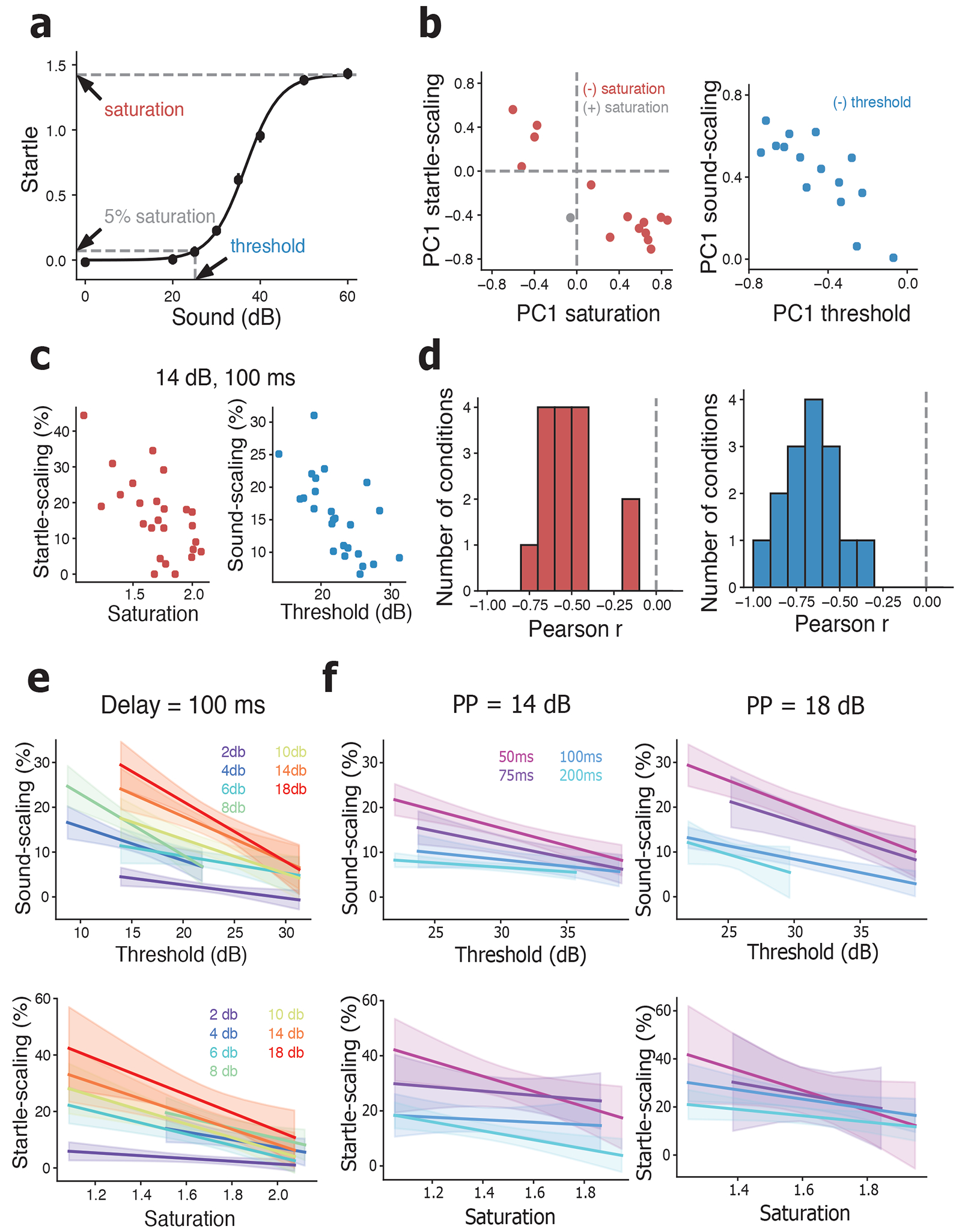
Figure 4.

Sound-scaling and startle-scaling covary with baseline startle curve. (a) Example baseline startle curve for the same animal from Figure 2a. Arrows and dashed lines indicate the saturation, defined as the asymptotic maximum of the sigmoid function, and the threshold, defined as the sound at which the curve reaches 5% of saturation. Solid line shows fit of the model to the data. (b) Scatter plot of PC1 startle-scaling weight versus PC1 saturation weight (left) and PC1 sound-scaling weight versus PC1 threshold weight (right) across all prepulse conditions. Dashed vertical and horizontal lines indicate PC1 weights of 0. Red points indicate prepulse conditions with opposite direction PC1 weights between startle-scaling and saturation. Blue points indicate prepulse conditions with opposite direction PC1 weights between sound-scaling and threshold. (c) Example scatter plots of startle-scaling versus saturation (left, r2 = 0.40) and sound-scaling versus threshold (right, r2 = 0.44). For both plots the prepulse sound was 14 dB and the delay was 100 ms. (d) Distribution of Pearson’s r values for all prepulse conditions of startle-scaling versus baseline saturation (left) and sound-scaling versus baseline threshold (right). Dotted vertical line shows r value of 0. (e) Linear regressions of sound-scaling versus baseline threshold (top) and startle-scaling versus baseline saturation (bottom) at different prepulse sound levels. Warmer colors indicate louder prepulse sounds. (f) Linear regressions of sound-scaling versus baseline threshold (top) and startle-scaling versus baseline saturation (bottom) at different delays. Warmer colors indicate shorter delays. For e & f, shaded area around lines indicate 95% confidence intervals of the regression.
