
Figure 4. Scatterplot of mean journal PQ1(t,d) and the journal’s impact over time.
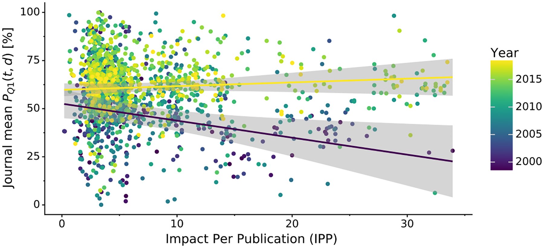
Variation in mean journal PQ1(t,d) (y-axis) in a given year (color) plotted against the journals Impact Per Publication (IPP). IPP uses the same formula as the 3-year Impact Factor, but is based on publicly available Scopus data. The two regression lines show linear trends for 1999 (indigo) and 2018 (yellow) along with 95% confidence intervals (gray areas).