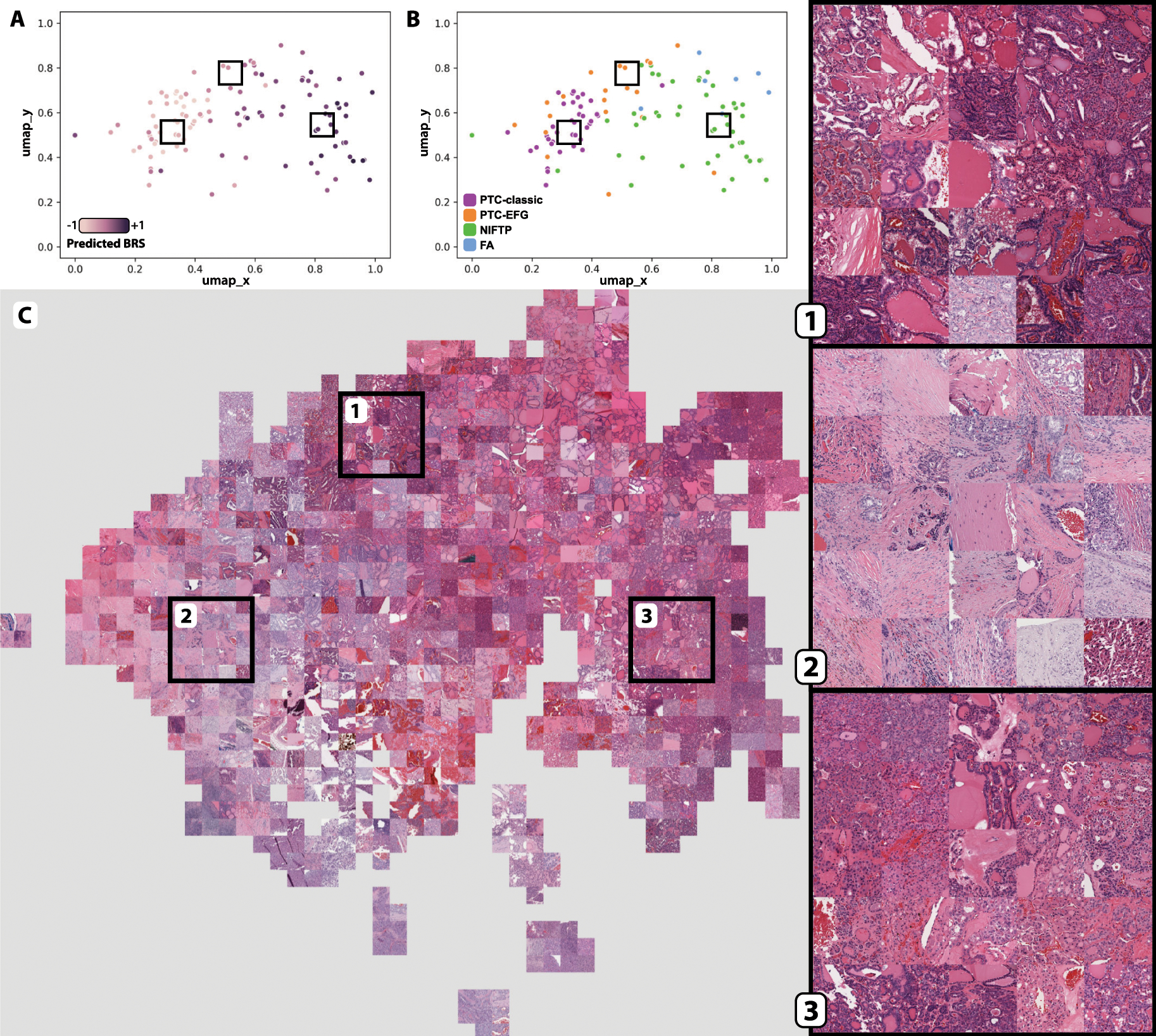
Figure 4. Mosaic map of institutional cohort, mapped with post-convolution activations generated from the DL-TCGA-BRS model.

A. Post-convolution layer activations for all image tiles in the institutional cohort were calculated by using a model trained on TCGA slides to predict BRS. Tile activations were then mapped using UMAP, and centroid tiles for each slide were plotted as with Figure 2. Slides are colored according to predicted BRS, with dark purple indicating high predicted BRS and light purple indicating low predicted BRS. Boxes correspond to the areas of interest highlighted in C. B. Same as A, with slides labeled according to tumor subtype. C. All tiles, rather than just slide-level centroid tiles, were plotted using UMAP as with A and B. A mosaic map was then created from this UMAP plot by replacing plotted tiles with their corresponding images, organized into a grid pattern. Three areas were chosen for magnified display. Area 1 is enriched for tiles that come predominantly from PTC-EFG slides, with low predicted BRS, as can be seen by comparing this area with A and B.
