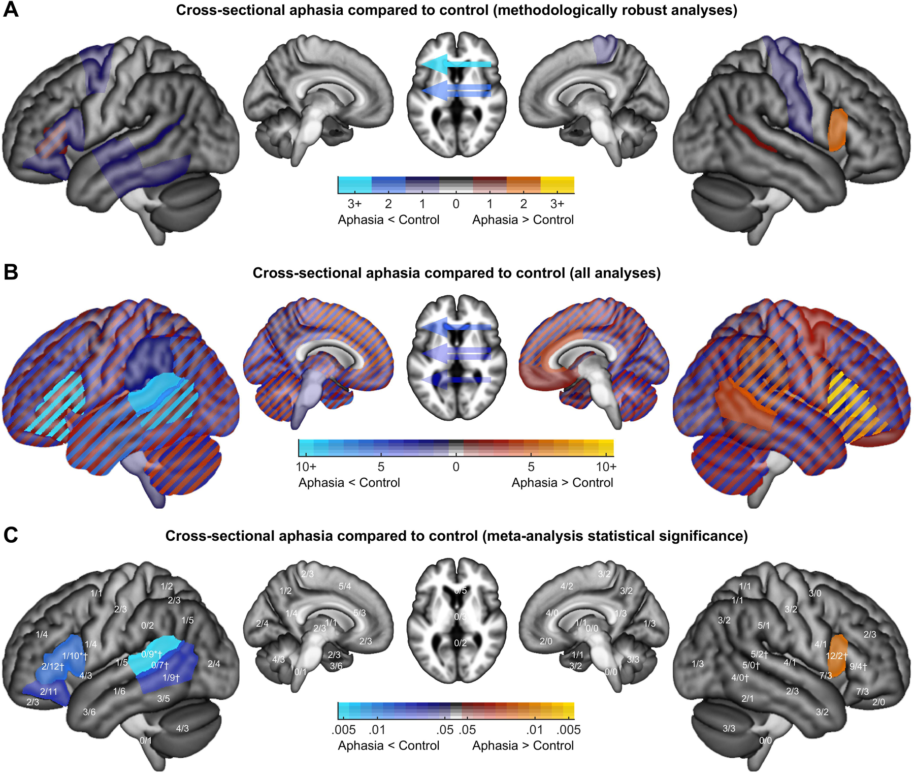
Figure 10.

Findings from cross-sectional analyses in which individuals with aphasia were compared to neurologically normal participants. A. Methodologically robust analyses. For each brain region, hot colors indicate the number of analyses reporting greater activation in aphasia compared to control, while cool colors indicate the number of analyses reporting less activation in aphasia compared to control. B. All analyses. Colors indicate the number of studies reporting greater or lesser activation in aphasia compared to control. Diagonal stripes are used for brain regions where both increased and decreased activation have been reported. C. Statistical assessment of all analyses. The two numbers shown for each region indicate the number of activation increases/decreases. Color coding indicates the uncorrected p value of binomial tests comparing the number of activation increases to the number of decreases reported in each brain region. * = significant difference in the prevalence of increases and decreases (binomial test, p < 0.05 after correction for multiple comparisons). † = significant difference in the hemispheric difference between the prevalence of increases/decreases between hemispheres (Fisher’s exact test, p < 0.05 after correction for multiple comparisons).
