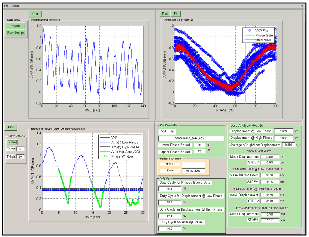
Figure 2.
The respiratory trace analysis software with patient data. The four panels shown going clockwise from the top left are (1) the entire breathing trace (2) the displacement versus phase data (blue) with the fit (red) and phase gates (green) (3) Plot of the displacement versus time trace with the phase gate (green circles), displacements at the low and high phase boundaries (blue and black dotted lines) as well as the average of these values (red dotted line).

