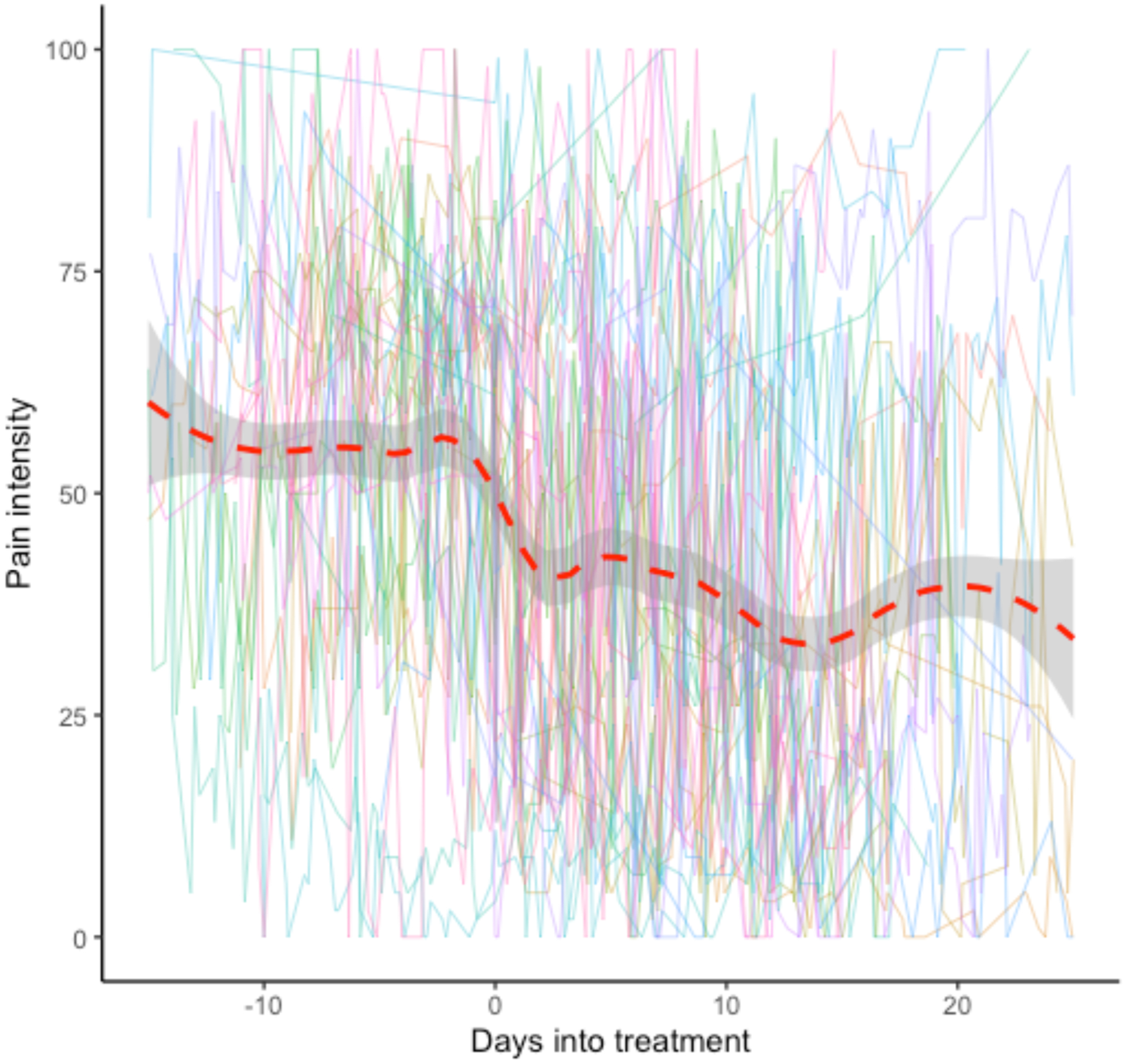
Figure 1. Pain Intensity Trajectory of 37 Adults Pre- and Post- Medical Cannabis Treatment.

Note. The individual lines represent the real-time pain intensity ratings for each participant over time. The red dash line represents the overall trend of the 38 participants. Data from all participants were aligned so that Day 0 was the first day of starting medical cannabis for each participant. The time axis therefore indicates how many days before (negative numbers) or after (positive numbers) medical cannabis treatment. The overall trend curve was constructed using LOWESS with bandwidth of 0.3 (Cleveland, 1979). The overall trend curve was constructed data up to 15 days before and 20 days after Day 0, given that this was the period where the majority of participants had available data.
