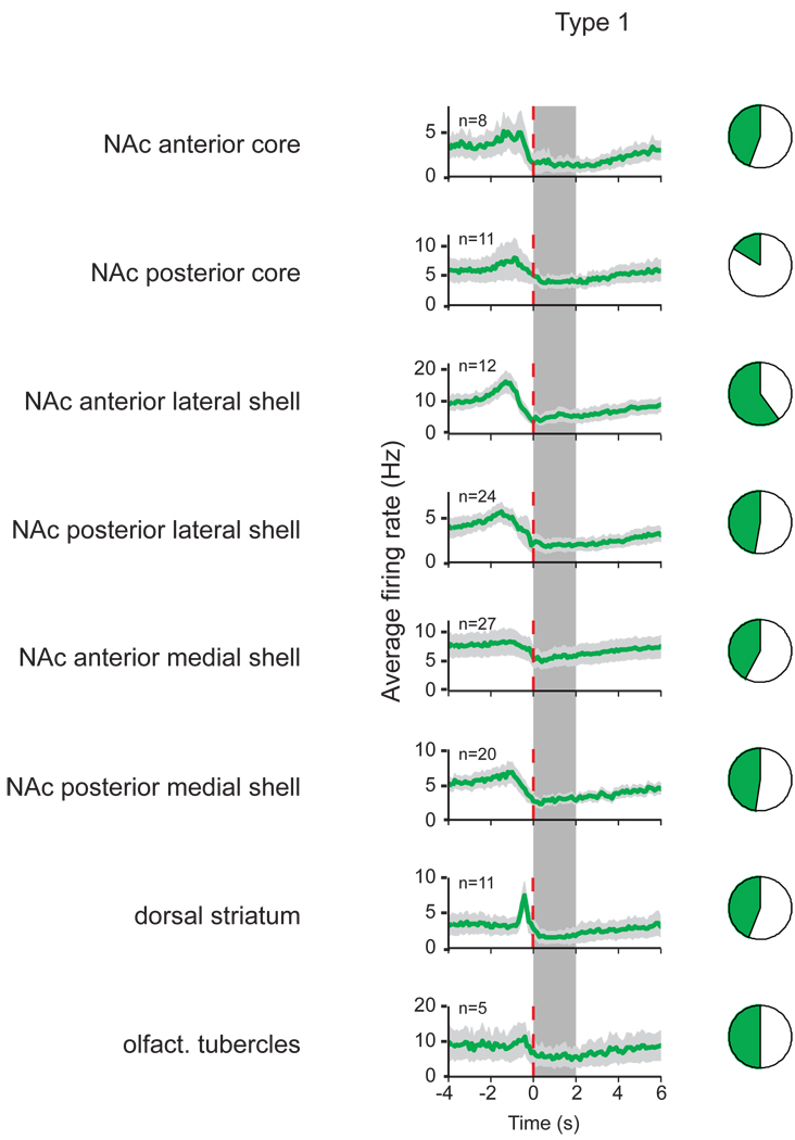
Figure 3.
Type 1 neuron firing patterns and their proportions in different subregions. Average firing rate with standard error of the mean (light gray) is shown in PETHs around the onset of sucrose availability (vertical dashed line) for each of the 8 subregions (100 ms bin size). The number of each neuron type recorded is indicated in the upper left corner of each PETH, and the dark area in the pie chart next to each PETH represents the fraction of the neuron type of all neurons recorded in that subregion. The availability of sucrose is indicated by the vertical gray bar, and lasted up to 2 s (randomized between 1, 1.5 and 2 s in each trial).

