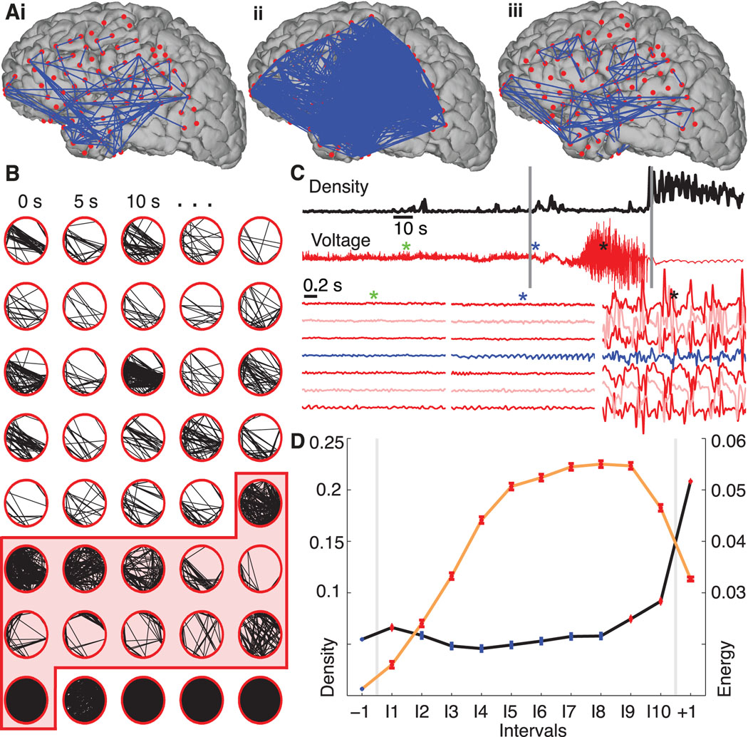
Figure 1.
Network synchronization increases at ictal onset and offset, but falls to preictal values during the seizure. (A) Representative networks just before the seizure starts (i), at seizure initiation (ii), and in the middle of the seizure (iii) from a single seizure in a single patient. In this example the electrode locations have been projected onto a reconstruction of this patient’s cortical surface. Because some of the electrodes can not be easily visualized in this 2-dimensional representation, the data are displayed as circular networks containing all electrodes as individual nodes. (B) The networks progress from left to right, top to bottom, with a 2.5 s interval between networks. We arrange the 97 electrodes in a circle (without reference to their physical locations) and indicate sufficiently strong coupling between electrode pairs with black lines. The shaded region denotes the ictal interval. Visual inspection of the evolving network topologies suggests increased network density (i.e., more edges) near ictal onset and termination. (C) The network density (black) and ECoG data from a single electrode (red, upper) for the representative example. At ictal onset and termination, indicated with the vertical gray lines, the network density increases dramatically, while during the middle portion of the seizure the ECoG data exhibits large amplitude fluctuations. The colored asterisks indicate the location of three, 2s intervals plotted for representative grid and strip electrodes below, including the activity of the presumptive onset electrode as identified by the clinical team (blue trace). (D) The density (black curve) — averaged across all subjects and seizures and adjusted for differences in subjects — for 12 time intervals: one preictal −1, ten ictal I1,I2,…,I10, and one postictal +1. In each interval, the circle indicates the mean density (n=9049 networks preictal, n=939 networks per ictal interval, and n=2817 networks postictal) and the vertical lines the standard error. Statistically significant increases in density compared to preictal values (see Methods) are indicated in red and occur at ictal onset (interval I1) and near ictal offset (intervals I9, I10, +1). We also plot the normalized signal energy (orange curve) for each interval averaged across all subjects and seizures (n=45609 preictal, n=3614 per ictal interval, and n=10842 postictal). Unlike the density, the signal energy increases significantly above preictal values for all ictal and postictal intervals.

