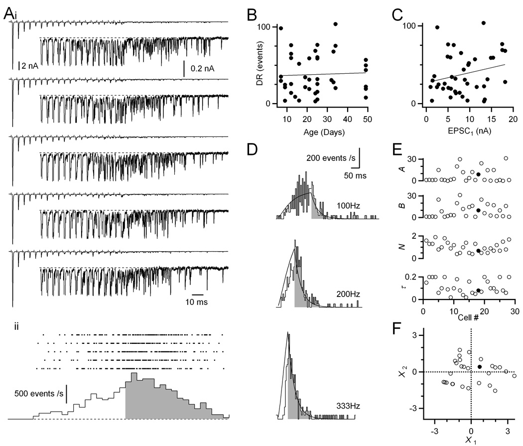
Figure 2. Delayed release is prominent in endbulbs of all ages.
(A) Representative example of delayed release for a P49 endbulb. (i) Sample traces in response to AN fiber stimulation in trains (20 pulses at 200 Hz). Insets are magnified views of the later part of the train. (ii) Raster plot of the timing of delayed release events (top) and poststimulus time histogram of the raster data (bottom). Delayed release rates during and after the train are indicated by the open and shaded parts, respectively. The histogram is corrected for the period of the stimulus artifact and synchronous EPSC when delayed release cannot be measured.
(B) Levels of delayed release are fairly constant over development (r = 0.04, N = 43 cells).Delayed release is quantified as the total number of events for the 400 ms following the train (shaded region in A).
(C) Levels of delayed release correlate with initial EPSC amplitude (r = 0.24).
(D) Delayed release rates for a representative endbulb plotted as a histogram. The line is a fit to the data using the model of Atluri and Regehr (1998) (see Methods).
(E) Model parameters for 28 cells analyzed similarly to the cell in D. The slices were from P14–49 mice. The filled circles mark the parameters for the cell in panel D.
(F) Principal components analysis of the fit parameters. The first two principal components are plotted for all 28 cells in the dataset. These accounted for 89% of the variance. A cell near the middle of this dataset (filled circle, also shown in panel D) was selected as the “average” amount of delayed release.

