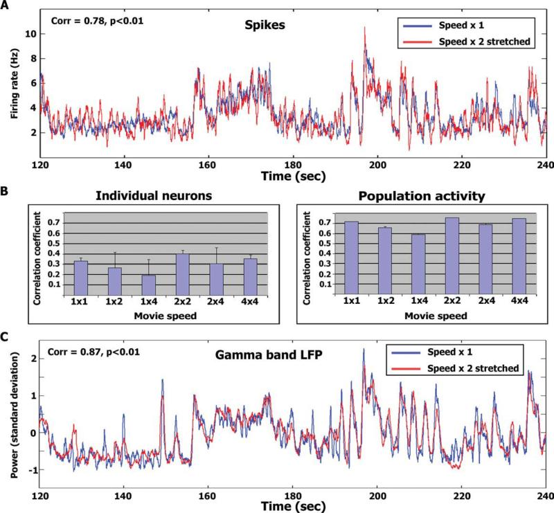
Figure 5.
Stretch analysis. (A) Average temporal profile of spikes (N = 25 cells) during normal speed presentation (blue traces) superimposed with the temporal profile during double speed presentation stretched in time (red traces; see Stretch analysis in Methods). The figure depicts 2 min of the experiment [starting at 120 (60) s into the normal (double) speed stimulus presentations]. The full time courses for the entire duration of the experiment are provided in supplementary Figures 8 and 9. Correlation level and significance for each time window are in the top left corner. (B) Average correlation level of individual neurons (left) and the population (right) within and across presentation speeds. Error bars denote S.D. across the number of correlation values averaged. (C) Same as (A) for high γ-band LFP power modulations (N = 21 electrodes).

