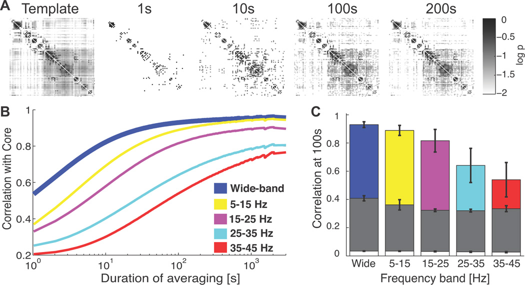
Figure 3. Stable network templates appear on a ~100s timescale.
(A) Example 24hr network template (left), and average network connectivity over different timescales, for a single patient. In each subfigure, a (row, column) element corresponds to an electrode pair, and the nodes are ordered to locate edges along the template diagonal. Darker shades of gray indicate more persistent interactions between a pair (colorbar indicates log10 probability of edge appearance). In the 1s template, interactions either exist (black) or not (white). After ~100s of averaging, a network connectivity similar to the 24hr average template emerges. (B) The two-dimensional correlation of networks averaged over different durations (1s to 3000s) and the network template for all patients. The different color curves indicate different frequency bands. At short averaging durations, a rapid increase in correlation emerges; this increase shifts to larger durations as the frequency band increases. (D) The average correlation at 100s for the observed data (color bars, legend in B), time shifted surrogates (gray bar), and shuffled networks surrogates (white bar). Notice the trend in the observed data towards decreasing correlation with the template as the frequency band increases.

