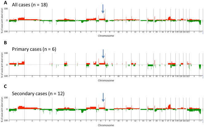
Figure 1.
Penetrance plots showing the frequency of gain and loss of genomic regions within a) all 18 AS evaluated by aCGH, b) all primary tumors and c) all secondary tumors. Each chromosome is represented on the x-axis, and the y-axis indicates the % gain or loss of the corresponding genomic region within the corresponding population. Gains are shown in red and losses in green. The position of MYC genomic region is indicated by an arrow.

