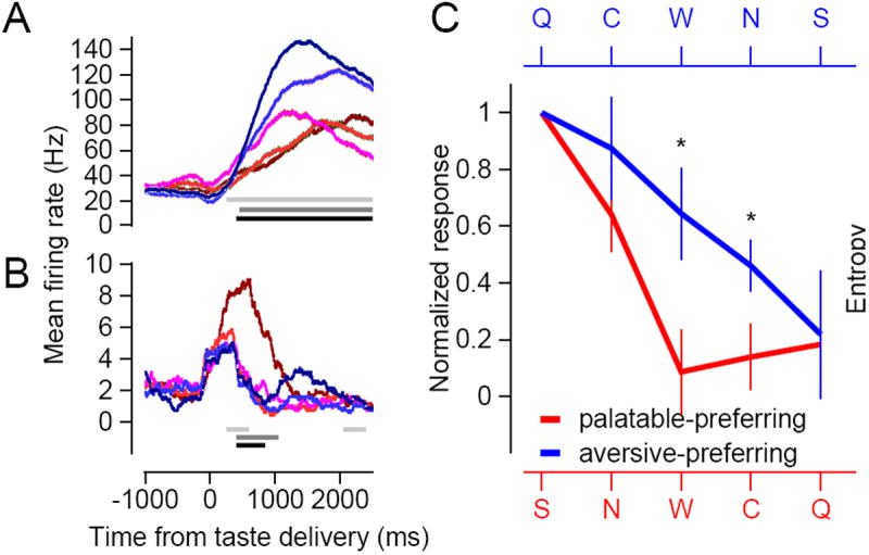
Figure 5. Comparison of the dynamic range of palatable- and aversive-preferring neurons.

A-B) Each set of colored traces represents the average responses of an example neuron to the 5 taste stimuli. Each response is smoothed with a 500 ms rectangular filter. C) The thick lines plot the average normalized response curves across all 5 tastes, in order of strongest to weakest, for the palatable-preferring (red) and the aversive-preferring (blue) neurons. Error bars represent standard error measurements across neurons within each group, and asterisks denote statistically significant differences (p<0.05) between the two groups, as determined by a Wilcoxon rank sum test.
