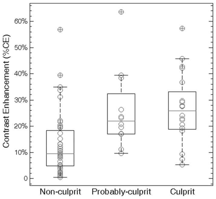
Figure 5.
Graph comparing degree of contrast enhancement for nonculprit, probably culprit and culprit plaques. Box plots represent medians (gray lines) and interquartile ranges of degree of contrast enhancement. Nonculprit plaques had a lower degree of contrast enhancement than did probably culprit (13.6% ± 12.3 vs 25.8% ± 15.0, P = .02) and culprit (13.6% ± 12.3 vs 25.9% ± 13.4, P = .003) plaques. However, there was no difference in degree of contrast enhancement between probably culprit and culprit plaques (P = .71).

