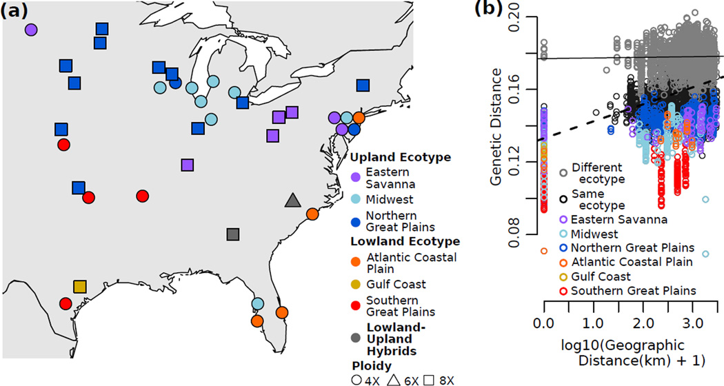
Figure 2.
Geographic patterns of genetic diversity. (a) Map of populations. Color corresponds to inferred regional gene pool and shape corresponds to predominant ploidy. (b) Patterns of isolation-by-distance shown by all pairwise comparisons of genetic and geographic distance. Gray = between ecotypes. Black = within ecotype. Colors = within each regional gene pool. Lines representing the linear regression of all between-ecotype comparisons (solid line, slope = 3.5×10⁻⁴) and all within-ecotype comparisons (dashed line, slope = 9.4×10⁻³) indicate greater IBD within ecotypes than between ecotypes.

