
Fig. 2.
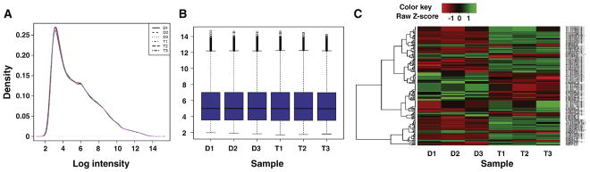
Quality control assessments for the dataset. A, a plot of the log-intensity distribution in the experimental chips of the dataset. B, intensity box plot. The plot compares the probe intensity levels between the arrays of the dataset. Either end of the box represents the upper and lower quartile. The line in the middle of the box represents the median. C, A heatmap comparison of the six samples in the dataset. D, DMSO; T, UF010 treatment.