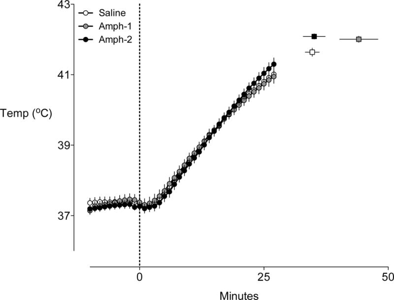
Figure 3. Temperature curves for rats running to exhaustion in the heat.

The mean temperature curves (generated between −10 and 27 min) for each group are shown. These times points were chosen as the represent the period in which no animals had yet achieved exhaustion. The corresponding squares to the right of the graph represent the grouped mean time to exhaustion and temperature at exhaustion. Error bars represent ± SEM, n=8 for each group
