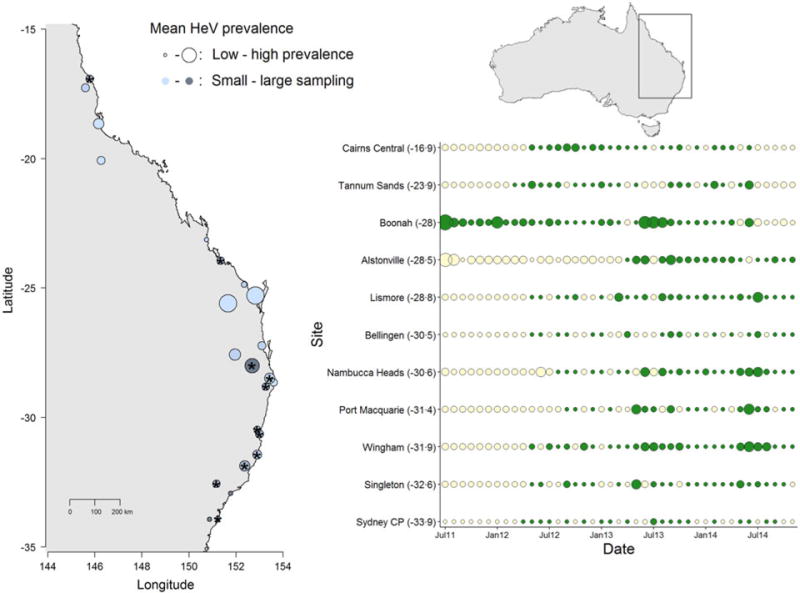
Fig. 1.

Spatial and temporal variation in Hendra virus prevalence in Eastern Australia. The map (left) shows average prevalence across sites: bigger dots are higher prevalence and the light-dark blue gradient represents low–high sampling intensity. The panel (right) shows the temporal variation in Hendra virus prevalence for 11 sites marked with ‘*’ in the map, chosen because of their large temporal representation. Sites are ordered from north (top) to south (bottom) and dot size is proportional to prevalence magnitude (green coloring are sampled data, whereas cream coloring are predicted prevalence values from a Bayesian imputation procedure described in the methods). The smallest dots are instances when Hendra virus prevalence = 0. Models estimating periodicity and synchrony employ data from January 2012 onwards. We show data starting from 2011 to emphasize the high prevalence observed in Boonah.
