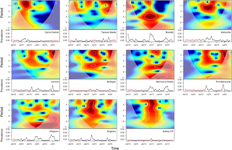
Fig. 2.

Wavelet analyses of Hendra virus prevalence across sites. Top panels show periodicity in months as a function of time. Warmer areas show the wavelet power spectrum concentrating around the periodicities of high support. The white lines encircle areas with high confidence in the periodicity of Hendra virus prevalence. The shaded area outside the cone delimits times that may suffer from edge effects in the calculation of the wavelet power spectrum and we therefore do not interpret the results from these areas. Bottom panels show prevalence as a function of time (red dots indicate predicted values).
