
Figure 4.
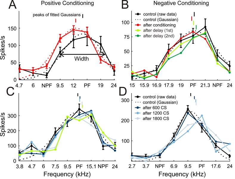
Example tuning curves. A,C, Positive conditioning examples. B,D, Negative conditioning examples. Pre-conditioning iso-intensity tuning curves are plotted in black. Post-conditioning curves are either shown as the average of all three post-conditioning mapping blocks (plotted in red, as in A and B), or individually for the first (dark blue), second (mid blue) or third (light blue) post-conditioning mapping blocks, as in C and D. The persistence of the shifts in the iso-intensity frequency tuning curves is depicted in B and C by the post-conditioning curves obtained at different delays (light green, first delay period; dark green, second delay period). Best frequencies (peaks of fitted Gaussians) are indicated by vertical lines above the tuning curves. Gaussian fits (dashed line) and error bars are shown for both pre- and post-conditioning tuning curves in A, but, for clarity, for the pre-conditioning tuning curves only in B, C and D.