

Abstract
Many bioinformatics applications construct classifiers that are validated in experiments that compare their results to known ground truth over a corpus. In this paper, we introduce an approach for exploring the results of such classifier validation experiments, focusing on classifiers for regions of molecular surfaces. We provide a tool that allows for examining classification performance patterns over a test corpus. The approach combines a summary view that provides information about an entire corpus of molecules with a detail view that visualizes classifier results directly on protein surfaces. Rather than displaying miniature 3D views of each molecule, the summary provides 2D glyphs of each protein surface arranged in a reorderable, small-multiples grid. Each summary is specifically designed to support visual aggregation to allow the viewer to both get a sense of aggregate properties as well as the details that form them. The detail view provides a 3D visualization of each protein surface coupled with interaction techniques designed to support key tasks, including spatial aggregation and automated camera touring. A prototype implementation of our approach is demonstrated on protein surface classifier experiments.
Keywords: Categories and Subject Descriptors (according to ACM CCS), J.3.1 [Computer Applications], Life and Medical Sciences—Biology and Genetics
1. Introduction
The core challenge of structural biology is to understand how the form of a molecule connects to its function. A key approach is the development of computational models that predict locations on the surfaces of molecules where, for example, the molecule will bind with another. Such models are validated by comparing their results with experimentally-derived ground truth. Inspecting these results on a single molecule is challenging as the similarities and differences are spread around a 3D surface that has occlusions and irregular shape. Detailed examination of the results of an experiment involving dozens of molecules is prohibitive. Bioinformaticians typically resort to examining only aggregate statistics, losing the opportunity to examine the details of the experiments to find interesting cases within the set or to provide feedback to the modeling process.
This paper introduces an approach to explore the results of classification validation experiments. We focus on surface classification, where the model predicts whether each location on a protein's surface is likely to bind to another molecule. The challenge is to provide an overview of the results of an entire validation experiment with many molecules, allowing the viewer to identify locations of interest, while retaining facilities for examining the specific details of interesting sites. Our approach addresses this challenge with a small-multiples view designed to allow a viewer to see aggregate properties on individual molecules as well as to identify details of interest that lead to these properties. This overview is connected to a detail view that provides specialized navigation controls over the 3D structures, allowing regions of interest to be examined rapidly.
Our approach is based on two key ideas. The first is that an overview can be designed specifically for understanding aggregate properties over multiple scales. Using 3D views of molecules for the overview is impractical, as they require more space, more time to navigate each surface, and do not afford quick summarization. Instead, we build on recent work demonstrating that people can perceive aggregate properties over certain kinds of displays to design 2D views that allow the viewer to quickly assess classifier results across an entire set of molecules. This overview can be used to identify specific molecules to explore more closely in 3D, as well as to suggest features of interest on these surfaces. The second key idea is to use information about the viewer's interest to drive navigation along the surface. Our approach abstracts information over the surface to identify discrete regions of interest, which are used to create navigation controls aligned with the information in the overview.
Bioinformatics classifier experiments are common: for example, a recent survey [IYA12] notes several hundred papers per year, in just three bioinformatics journals, involve presenting classifier validation results. The survey notes that most of these papers report only simple statistics, at best providing statistical confidence tests. Better tools for exploring the results of these experiments could improve predictive model development and application. For example, identifying specific molecules or classes of molecules where a classifier performs well may help in understanding the generality of the predictive model. Identifying false positives may help in selecting challenging decoys. Patterns of false negatives may suggest alternative mechanisms not represented or captured in the model training process. Individual errors can be assessed to see if they are near misses or anomalies.
The results of classifier validation experiments have a simple form. For each object in a corpus, every location has a prediction (positive or negative) marked by its correctness (true or false). This work specifically considers protein surface classifiers, where the objects are protein surfaces and the locations are 3D positions along those surfaces. However, the problem of comprehending validation experiments exists in other bioinformatics domains, for example in classifying properties of sequences. The ideas of our approach should apply more generally. Although the detail views are specific to 3D shapes, similar ones could be developed to navigate long sequences.
In providing a system that addresses the needs of scientists assessing the results of surface classifier experiments, our work makes several contributions. We demonstrate that recent results in how viewers perceive visual information in aggregate can inform overview designs and provide examples showing how glyph designs can be created to support a variety of aggregate assessment tasks. We also show how region grouping can be applied to provide interface support for exploration tasks. While our approach is demonstrated in a specific application for examining molecules, we believe that the contributions generalize to similar domains.
To present our approach, we begin by considering related work in the visualization of molecules and machine learning results. We then discuss our overview display, exploring a space of designs that leverage perceptual principles to support various assessment tasks. Next, we describe our detail view, explaining our specialized molecular view and data-driven interaction designs that aggregate regions of potential interest to support the viewer's tasks. Finally, we conclude by describing a prototype implementation and example use cases.
2. Previous Work
The design of overview displays for large data collections is an important topic in visualization, see Hornbæk and Hertzum for a survey of the issues and approaches [HH11]. To be effective, overviews must be designed to support efficient visual processing by considering the abilities of the perceptual system, see Ware for an introduction [War12].
Perceptual science has built an understanding of the types of visual features that can be processed efficiently. The visualization community has built upon this knowledge to guide display design (see Healey and Enns for a survey [HE12]). These perceptually efficient, or “pre-attentive,” features allow for rapid search in complex displays by, for example, leveraging “pop-out” effects, where properly encoded features can be located quickly in a large complex displays. Our design follows these guidelines, using salient colors that allow the viewer to rapidly find important locations.
Recent research in perceptual science demonstrates that people can efficiently estimate aggregate properties of large collections of objects. For example, people can estimate numerosity [HSF06] and average size [Ari01]. Recent work in visualization (cf. [CAFG12, ACFG14]) shows that this applies to visualization displays, enabling visual aggregation where the viewer estimates statistical properties. Certain types of visual features, such as color, can be averaged more effectively than others [CAFG12], and performance can be further improved through other design choices. Albers et al. [ACFG14] consider a range of estimation tasks and show how different visual designs can lead to displays that excel at different tasks. Our approach follows previous examples of visualization systems specifically designed with these principles in mind (e.g. [ADG11, CAFG12]).
Flexible views can be effective to highlight patterns of interest when those patterns are not known a priori. A common approach for creating flexible views is to use a small-multiples display [Tuf91]. The ability to reorder juxtaposed small-multiples can help adapt them to support different tasks by spatially clustering objects with related properties. While the basic concept of a reorderable display was introduced by Bertin [Ber81], recent work by Slingsby et al. [SDW09] has highlighted the power of reordering to support answering the range of questions a viewer may seek. Our overview applies this flexible reordering approach.
2.1. Molecular Visualization
Many existing visualization tools have been developed to support molecular visualization tasks (see O'Donoghue et al. for a survey [OGF*10]). Modern molecular graphics systems provide many different views of large molecules, including views that encode data fields on molecular surfaces. Such programs can be used to show results of classifier experiments on specific molecules; however, they are not tailored to the specific needs of understanding classifier performance across a corpus of molecules. Our approach provides a similar view, but augments it with interaction techniques specific to the task, coupling it with an overview display.
A handful of existing systems provide visualization over collections of molecules. Some systems, such as the web interface to the Protein Data Bank (PDB) [BWF*00], provide visual galleries using standard 3D displays as icons for molecules. Karve and Gleicher demonstrate a system designed to provide an overview of the metadata of a collection of proteins [KG07], but the design does not consider specific tasks or support classification experiments, and their glyphs are not optimized for pre-attentive summarization. Khazanov and Carlson present statistical properties over a large collection of molecules [KC13], but use only standard summary statistic visualizations such as bar and line charts, and provide no connections to specific molecules. To the best of our knowledge, our approach is the first to consider providing an overview of a collection of molecules that supports both summarization and detail finding.
2.2. Machine Learning Visualization
Visualization for machine learning applications strives to communicate either the internals of the predictive process or trends in the outputs. Tools for understanding prediction processes are tailored to particular machine learning algorithms, such as linear SVMs [CCH01], decision trees [vdEvW11], and hidden Markov Models [DC08]. Our work falls into the latter, helping viewers to understand results.
Summarizing the results of a classifier can be problematic as there are different types of errors in a model [WFH11]. Several methods of quantifying performance exist [Pow11]. Basic metrics such as accuracy, precision, and recall do not capture the error profile and are problematic for biased distributions. The Matthews correlation coefficient (MCC) [Mat75] accounts for class distribution to compare a classifier's performance to chance, but still provides only a single summary statistic for performance.
Visual methods provide a more detailed presentation of machine learning results. Talbot et al. use an interactive visualization to let the user explore the contributions of individual models in an ensemble scenario [TLKT09]. Fails and Olsen show interactive adjustment of parameters to tune a predictive model [FO03]. The user can explore shortcomings in the model and make adjustments to improve it. Our work also provides this type of feedback.
3. Experiment Overviews
Experimental results for binary classifiers consist of a large number of classification decisions, each of which has one of four outcomes (true positive (TP), false positive (FP), true negative (TN) and false negative (FN)), that form the binary confusion matrix [Ste97]. While the data is simple, it grows quickly: experiments generally are run over dozens of molecules, and there are tens to hundreds of decisions for each molecule.
Our goal is to provide an overview of the collection of decisions and corresponding experimental results. In addition to showing overall performance, the overview should help identify the specific molecules, and even parts of molecules, for which the classifier performs well or not. For instance, it should allow the viewer to assess whether performance is uniform across all molecules or varying; to identify groups of molecules that perform similarly; to identify outliers or anomalies that may represent problems; or to see high-level patterns of performance between molecules. These assessments can occur at different scales, for example an anomaly might be a particular molecule whose performance skews results, or a family of molecules skewed by concentrated groups of false negatives.
Our approach uses two main ideas to support this range of needs. First, it emphasizes flexibility, allowing the viewer to reconfigure the display to suit their task. It allows for reordering and for selecting among a set of glyph types. Second, the glyph designs are designed to support rapid visual aggregation. This allows the viewer to see both the aggregate properties of the data and low-level details that form these aggregates.
3.1. Reorderable Small-Multiples Design
The overview uses a small-multiples display, where each molecule is shown as a small glyph in a grid. Different designs for the glyphs are provided (described below), but they share features that allow for pre-attentive summarization. Each glyph relies heavily on color encodings. Color supports pop-out [HE12] and pre-attentive summarization [ACFG14], making it useful for conveying aggregate properties as well as highlighting outliers. Each glyph has a gray border whose lightness gives an indication of the overall performance (MCC score, with darker borders representing a higher value).
The small multiples can be reordered to explore different types of questions. For instance, ordering by performance (e.g. accuracy or MCC) places molecules with similar performance together and allows for rapidly identifying strong and weak performers. Ordering by molecule name facilitates finding a specific item of interest. Ordering by metadata (properties of each molecule) emphasizes correlations between that property and performance. Coupling the different orderings with different glyph designs provides a wide range of configurations to support various questions. For example, sorting by the size of the molecule and choosing an appropriate glyph type can not only show whether large molecules perform better or worse than others, but can also indicate whether the errors form large groups on the molecules.
The overview provides some basic interaction features that directly support common tasks. Selecting a glyph can open the molecule in the detail view for closer examination. Sets of glyphs can be selected and opened in a new overview window, allowing for more localized analysis of subsets of the dataset. The user can annotate the glyphs in order to track which molecules have already been examined or should be explored in greater detail.
3.2. Glyph Design
3D views of the molecule would be difficult to see in the small space of the glyphs. Additionally, because at least half of the molecule is occluded, some form of navigation or surface unfolding would be required to make an assessment of the whole surface. The highly irregular shapes of molecules, with their significant pockets and protrusions, make meaningful flattening difficult. Our current set of glyphs does not provide a 3D or flattened view and therefore generally does not convey the spatial layout of data on the molecule.
Instead, we leverage nonspatial 2D views that sacrifice information about the spatial arrangement of elements in order to remedy occlusion problems inherent in 3D views. Further, these views can be designed to support rapid visual comparisons both within an element and between multiple elements by leveraging visual variables in the encoding design. In our system, we leverage color as the dominant channel to encode classification decisions to support rapid visual assessment, mapping TP to green, FP to blue, FN to red, and TN to gray. This color mapping leverages salience to support classifier analysis tasks by considering a priori characteristics of the data and task — TN are common and are mapped to gray to decrease their saliency, while FN represent highly undesirable classifications that generally require attention and are mapped to red.
Our system allows the user to switch between different glyph designs in order to configure the display to their task. Each design supports certain kinds of visual queries.
Histograms
(Figure 2a) are a standard encoding and are useful for showing the performance distribution within a specific molecule. However, they become harder to interpret when a single class dominates, and do not afford efficient visual aggregation.
Figure 2.
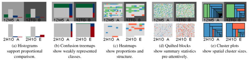
Different glyph encodings for overviews afford different observations about the data.
Confusion Matrix Treemaps
(Figure 2b) sacrifice some of the inter-class fidelity of histograms, but better show weakly represented classes and make better use of space to afford pre-attentive area judgements between elements. A vertical divider delineates the proportion of correct classifications (left side), and incorrect classifications (right), providing a quick indication of the predictive accuracy.
Heatmaps
(Figure 2c) encode the data from each decision using small patches visualized in sequence order. Because the size of the patches in a glyph is inversely proportional to the number of decisions in the corresponding molecule, this display gives a sense of the molecule's size. Averaging and proportion estimation is supported by the color encoded design. As residue sequence order is related to spatial proximity, this view can also provide some insight into how the various points are grouped along the surface.
Quilted Blocks
(Figure 2d) are similar to heatmaps, except that the placement of the pixels from each color patch is randomized within the glyph. This representation sacrifices any sense of the structure of the sample to make pre-attentive summary statistics easier to access [CAFG12] and to help highlight performance patterns at the molecular level.
Cluster Plots
(Figure 2e) use a squarified treemap representation [BHVW00] to indicate groups of similar classes that are spatially clustered on the surface. While the glyph does not convey the positions of the groups, it does convey their number and size.
The overview can visualize either raw binary decisions (positive or negative) or supplement these decisions with the respective confidence of each decision. The viewer can optionally show confidence values in the heatmap and quilted displays. When visualizing confidence data, each of the four colors is replaced by a three-step sequential color ramp in the same hue drawn from Colorbrewer [HB03].
4. Detail View
While 2D overviews trade-off spatial information to communicate performance across multiple proteins, showing classifier decisions in the context of the surface is important for understanding the connection between molecular shape, chemical properties, and the decisions. Unfortunately, presenting the classification results on a molecular surface has several problems. Because the 3D view necessarily occludes much of the surface, especially when there are pockets and crevices, finding locations of interest can be challenging. Also, when examining multiple disjoint features, the viewer must remember which ones have already been examined. Our approach attempts to remedy such issues for classification results presented on the molecular surface through interaction techniques designed to assist search and memory.
The detail view is a standard molecular surface visualization, with triangle mesh surfaces created using MSMS [SOS96]. Following [TCM06], we apply stylized shading to convey shape, which inclues ambient occlusion shading and contours. We perform visibility calculations for ambient occlusion on the bounding sphere about the surface. Predictions are encoded on the molecular surface using the same color scheme as the overview.
4.1. Regions of Clustered Data
Protein classification necessarily discretizes the molecular surface, though this sampling hides the fact that the molecular surface is a continuous field. The viewer's perceptual system can group similar points to identify patches [Pal92]; however, when the sampled predictions alone do not form coherent visual structures due to issues such as noise or undersampling, perceptual grouping may be insufficient.
We simplify the extraction of high-level continuous patterns from classifier data by explicitly grouping predictions along the surface. This approach represents a trade-off of fidelity for simplicity: we sacrifice information about individual points in order to better characterize the high-level continuous properties of the surface. This surface grouping is illustrated in Figure 3. Classification regions are built by performing connected components on labeled vertices. The resulting boundaries are jagged, but precise. The regions can be simplified by smoothing region boundaries by the morphological operations of dilation and erosion [Ser82].
Figure 3.

Clustering similar values creates discrete regions that can be identified visually and by interaction.
Grouping points into clusters provides a number of benefits. Visually, it allows the display to emphasize the differences between groups by clearly marking the boundaries. Simplifying boundaries reduces visual noise, making high-level patterns more apparent. The resulting reduced set of elements also simplifies user interface support for interfacing with task-driven interaction techniques. For instance, the discrete list of clusters provides a visual checklist for the viewer to record regions they have already examined (Figure 5). Coupling this list with automatic navigation, we eliminate the need to manually locate regions of interest along the surface. Such identification is particularly valuable in locating small regions.
Figure 5.

Our approach applied to the validation of a DNA-binding classifier. The overview window (left) displays the corpus rendered as quilted blocks (§3.2), giving an idea of aggregate performance across the corpus. The detail window (right) shows the clustered classifications (§4.1) for PDB: 1PVR_A, highlighted in yellow in the overview window. These clusters are itemized (lower right), allowing for highlighting regions of interest and automatic navigation to view a selected region.
4.2. Automatic Viewpoint Selection
Locating individual clusters can be challenging. While some clusters may be large and easily identifiable, others may be small, hidden in pockets, or occluded from the current viewpoint. Automatic viewpoint selection brings a selected cluster to the center of the viewport without requiring the user to manually navigate the surface. A user may navigate by selecting a cluster from a reorderable list. Our method for viewpoint selection builds on previous literature on finding optimal viewpoint navigation [VFSH01].
We characterize a “good” viewpoint as one that maximizes the visible area of the cluster. To simplify the search for the best viewpoint for a given cluster, our approach restricts camera positions and paths to a bounding sphere about the surface. Our implementation computes the visibility for each vertex of the surface mesh, from a sampling of directions, when the surface is first loaded. This is used for illumination computations to create ambient occlusion shading and is also used for automatic viewpoint selection. To find the best viewpoint for a region, the sampling direction from which the most vertices of the requested region are visible is selected. The corresponding point on the bounding sphere of the molecule is chosen for the new viewpoint. The viewing direction (look-at point) is chosen as the center of the region.
Transitions to a selected camera position are created by spherically interpolating the viewpoint on the bounding sphere, and linearly interpolating the look-at point. These smooth transitions help the viewer remain oriented when they select a region to transition to. These transitions also serve as the building block for “automatic tours,” where the system generates a list of regions and shows them to the viewer in sequence. Such tours are useful to give an impression of the entire surface of a molecule.
4.3. Predictions and Scalar Fields, Simultaneously
Molecular graphics programs frequently use surfaces to display scalar data fields such as electrostatic charge and hydrophobicity. Bivariate encodings can be used in order to make comparisons between these data fields and the classification decisions. Although bivariate color ramps can encode two fields [War12], it is difficult to extract each independent dimension from the encoding [War09]. Bivariate ramp design is further complicated by luminance changes introduced by shading on the molecular surfaces. Therefore, we instead use textures to convey the classifier decisions, and reserve color for encoding the field of interest.
Complex surfaces generally do not lend themselves well to traditional surface parameterization for two-dimensional texturing. We instead use 3D procedural textures [Per85] as they can be mapped using only the coordinate system of the molecule. Classification results are depicted using three disparate textures (TP as checkers, FP as grid, FN as Perlin noise [Per85]). For example, in Figure 4, the relationship between an input feature (electrostatic charge) and the classification result is visualized by encoding feature data with a seven-step, purple-to-green color ramp and classifications with texture. The scalar field color ramp is intentionally distinct from the colors used to encode classification results alone to avoid confusion. A histogram (bottom-right in Figure 4) displays the distribution of the scalar field feature alongside the boundaries of the color ramp. This graph serves as a control widget for updating the transfer function, allowing the color ramp to be modified interactively.
Figure 4.

A multivariate encoding for a scalar field (shown as the purple-to-green color field) overlayed on classification values shown as procedural textures (checkerboard, grid, Perlin noise). Note how TP (checkerboard) and FP (grid) generally correlate with positive charge (green), suggesting a correlation between charge and positive predictions.
4.4. Dynamic Decision Boundary
To further help understand the classifier outputs, the decision boundary for the classifier can be adjusted in the detail view. Changing this boundary affects the classifications of predictions by raising or lowering the threshold of a positive prediction. The detail view (Figure 5) contains a histogram illustrating the distribution of classifications for the visualized molecule in the context of the current decision boundary. The viewer can directly manipulate this boundary to highlight predictions with a high confidence while reclassifying the remainder and can push the new decision boundary back to the overview to reclassify the entire corpus.
5. Use Cases
The prototype implementation of our approach is implemented in C++, using FLTK and OpenGL 3.3. The system can read in classification results for an entire corpus experiment in a few seconds. In all cases we have tried, the overviews are drawn in a fraction of a second so reconfigurations of the overview display (reordering or changing glyph type) is nearly instantaneous. The surface meshes for each protein are generated using a standard external tool, MSMS [SOS96]. While this tool may take up to several minutes to generate a surface mesh for a large protein, these meshes can be pre-computed before an interactive exploration. Our system can load a mesh and perform the visibility computations required for ambient occlusion and navigation in less than three seconds, even for very large molecules. Timing information used a machine with an Intel i7 920 (2.67 GHz) CPU and a nVidia GeForce GTS 250 graphics card.
We demonstrate our methods using two protein classifier datasets: a DNA-binding classifier with a test corpus of 219 proteins (Figure 5) and a calcium-binding classifier with a test corpus of nine proteins (Figure 7). Prior to our tool, assessment of results was done by looking at tables of statistics, and by loading surface colors into standard molecular graphics tools. The executable and use cases are available online at the project website at http://graphics.cs.wisc.edu/Vis/PSCVis/.
Figure 7.

Analysis of a surface descriptor-based, calcium-binding classifier. Modifying the decision boundary indicates that calcium may bind in multiple environments not adequately generalized by the classifier.
5.1. DNA-binding Classifier
Figures 5 and 6 show a validation experiment of the DNA-binding, residue-granularity, predictive binding model named DNA-Binding Site Identifier (DBSI) [ZEM13]. Ground truth labels indicate that DNA has been found to bind within five Angstroms of the residue in the crystallographic structure. The model performs well, in terms of summary statistics including F1 and MCC scores. However, closer examination of the validation results reveal more about its performance.
Figure 6.

Analyzing the spatial clustering of a DNA-binding classifier reveals high-level trends of classification.
Figure 5 shows the DBSI test set (219 proteins, sizes of 41–932 residues) loaded into the visualization prototype. Using an overview with quilted blocks ordered by performance confirms the overall peformance, but shows three different types of errors. Molecules with good overall performance (MCC) are predominantly TP, with some FN and FP. Mid-performing molecules often have some TP, but also large FP regions. Poorly performing molecules often have large amounts of FN.
To examine the first type of errors, a region cluster plot shows that many molecules have large TP regions, and many small incorrectly classified regions. Examining these clusters in a detail view (e.g. Figure 6a) shows that the small errors are usually at the fringes of a correctly identified site. Automated touring allows multiple examples to be examined rapidly to confirm this trend. These “near-misses” are unlikely to be meaningful in practice as precise localization is difficult because proteins are dynamic. However, it suggests that the classifier designers consider spatial grouping in order to improve their performance scores.
The region cluster overview also showed patterns in the larger errors. One trend was molecules with large regions of FP and TP (Figure 6b). The detailed views show the FP regions surrounded the TP regions (Figure 6c). Screenshots of the visualization were used to communicate results to scientists, who suggested explanations. For example, binding different sequences of DNA could result in minor conformational differences that change the label of nearby residues.
A third observation came from examination of some of the poor performing molecules. The overview identifies molecules with large false negative clusters. When examined in the detail view), they often have a false negative cluster with a long narrow shape (Figure 6d). The linear nature of the binding site does not seem to be captured by the classifier — instead of the typical conformation of the protein enveloping the DNA, the binding site of this particular protein seems to tuck itself into the grooves of DNA.
These three observations use elements of our approach, with chosen overviews leading to details. Each would have been difficult, or impossible, to make with the traditional approach of tables of statistics and manual inspection.
5.2. Calcium-binding Classifier
We applied our system to the validation of a calcium-binding classifier based on surface descriptors [CPG12], but using a simpler machine learning approach than in the paper. The validation experiment had 11 proteins. As decisions were made for each mesh vertex, each molecule had between 11k and 63k data points.
This classifier performs poorly over the test corpus (MCC: 0.163); this is shown in Figure 7a. The large number of FP (blue) shows that the classifier overestimates the number of binding sites. Examining a specific example (Figure 7b, left) confirms this trend. Adjusting the decision boundary to be more conservative (Figure 7b, right) better captures the true binding sites. Pushing the adjusted boundary to the entire test corpus reveals that the more conservative decision boundary causes entire binding sites to be missed (red, FN, Figure 7c).
Corpus-level visual inspection reveals some trends in the data and errors. The large number of small binding sites, and the diversity of these sites, suggests that calcium binds in many different kinds of environments. However, the error patterns show that while some sites are discovered correctly, many are missed. This suggests that the classifier is only capturing some of the ways that calcium may bind. The simple algorithm of the classifier, which cannot capture multiple modes, is insufficient; the complexity of the published algorithm may be warranted.
6. Discussion
This paper introduces an approach for exploring protein surface classifier validation results. The approach couples an overview of a collection of molecules with a detail view for examining specific molecules. The overview helps not only to identify patterns of performance across the corpus, but also to find specific molecules of interest. The detail view is designed to address the search and memory issues involved with exploring complex objects.
There are several limitations to this work. At present, it does not support the comparison of multiple classifiers. While some limited support for adjusting the decision boundary is provided, we have no explicit mechanisms to compare the different patterns that occur from adjusting this boundary. We also do not provide any 2D summaries that convey the relative spatial layout of disjoint classifications. For example, none of the current encodings can show that the false classifications occur close to true ones. While the overview supports direct navigation to detailed views of specific molecules, it does not allow navigation to specific regions of interest within these molecules. While our approach should apply to classifiers for objects other than molecular surfaces, we have not tailored the system for such applications nor designed new detail views.
The flexibility of our overview is a tradeoff: the ability to reconfigure the display allows it to support a range of queries; however, this requires the user to make informed configuration choices. In time, we will evolve the set of options and provide guidance on how to match them with tasks. In practice, we believe that rapid reconfiguration allows a user to find an appropriate view, potentially discovering other perspectives on their data en route.
To date, the evaluation of our approach has been limited to a few anecdotes and use cases. While specific elements of our design could be evaluated in controlled studies, direct assessment of the overall approach is more challenging. Tests on controlled data sets can allow the confirmation that users can actually identify the kinds of performance patterns our system is designed to expose. However, a better validation of our approach will be its success at helping in the design of more effective classifiers. A challenge will be to convince classifier developers of the potential value of close examination of their experimental results.
Even in our initial use cases, we have used the system to help reveal insights into the physical groupings of the classifications on protein surfaces. Overviews allowed identifying trends and selecting examples to explore in detail. The detail views enabled relating patterns of error to the performance of the classifiers.
Figure 1.

Visualization of a validation experiment for a DNA-binding surface classifier. The corpus overview (left) is configured to display each molecule as a quilted glyph and orders these glyphs by classifier performance to show how performance varies over the molecules. Selected molecules (left, yellow box) are visualized as heatmaps in a subset view (middle) and ordered by molecule size to help localize the positions of errors relative to correct answers. The detail view (right) shows a selected molecule to confirm that most errors (blue, red) are close to the correctly found binding site (green).
Acknowledgments
We thank Spencer Ericksen for providing the DNA-binding data. This work was supported in part by NSF awards CMMI-0941013 and IIS-1162037 and NIH award 5R01AI077376-07.
References
- ACFG14.Albers D, Correll M, Franconeri S, Gleicher M. A task driven framework for visualizing time series data. Proc 2014 ACM Human Factors in Computing Systems. 2014 doi: 10.1145/2556288.2557200. ACM. 3, 4. [DOI] [PMC free article] [PubMed] [Google Scholar]
- ADG11.Albers D, Dewey C, Gleicher M. Sequence surveyor: Leveraging overview for scalable genomic alignment visualization. IEEE TVCG. 2011 Dec;17(12):2392–2401. doi: 10.1109/TVCG.2011.232. 3. [DOI] [PubMed] [Google Scholar]
- Ari01.Ariely D. Seeing sets: Representation by statistical properties. Psych Sci. 2001;12(2):157–162. doi: 10.1111/1467-9280.00327. 3. [DOI] [PubMed] [Google Scholar]
- Ber81.Bertin J. Graphics and graphic information processing. Walter de Gruyter; 1981. 3. [Google Scholar]
- BHVW00.Bruls M, Huizing K, Van Wijk J. Data Visualization. Springer; 2000. Squarified treemaps; pp. 33–42. 5. [Google Scholar]
- BWF*00.Berman HM, Westbrook J, Feng Z, Gilliland G, Bhat TN, Weissig H, Shindyalov IN, Bourne PE. The Protein Data Bank. Nucleic Acids Res. 2000;28:235–242. doi: 10.1093/nar/28.1.235. 3. [DOI] [PMC free article] [PubMed] [Google Scholar]
- CAFG12.Correll M, Albers D, Franconeri S, Gleicher M. Comparing averages in time series data. Proc 2012 ACM Human Factors in Computing Systems. 2012 May;:1095–1104. ACM. 3, 5. [Google Scholar]
- CAG13.Correll M, Alexander E, Gleicher M. Quantity estimation in visualizations of tagged text. Proc 2013 ACM Human Factors in Computing Systems. 2013 ACM. [Google Scholar]
- CCH01.Caragea D, Cook D, Honavar VG. Gaining insights into support vector machine pattern classifiers using projection-based tour methods. Proc ACM 2001 Knowledge Discovery and Data Mining. 2001:251–256. ACM. 3. [Google Scholar]
- CPG12.Cipriano GM, Philips GN, Jr, Gleicher M. Local functional descriptors for surface comparison based binding prediction. BMC Bioinformatics. 2012;13(1):314. doi: 10.1186/1471-2105-13-314. 8. [DOI] [PMC free article] [PubMed] [Google Scholar]
- DC08.Dai J, Cheng J. HMMEditor: a visual editing tool for profile hidden Markov model. BMC Genomics. 2008;9:S8. doi: 10.1186/1471-2164-9-S1-S8. 3. [DOI] [PMC free article] [PubMed] [Google Scholar]
- FO03.Fails JA, Olsen DR., Jr Interactive machine learning. Proc 2003 ACM Intelligent User Interfaces. 2003:39–45. ACM. 3. [Google Scholar]
- GCNF13.Gleicher M, Correll M, Nothelfer C, Franconeri S. Perception of average value in multiclass scatterplots. IEEE TVCG. 2013;19(12):2316–2325. doi: 10.1109/TVCG.2013.183. [DOI] [PMC free article] [PubMed] [Google Scholar]
- HB03.Harrower M, Brewer C. Colorbrewer. org: an online tool for selecting colour schemes for maps. Cartogr J. 2003;40(1):27–37. 5. [Google Scholar]
- HE12.Healey CG, Enns JT. Attention and visual memory in visualization and computer graphics. IEEE TVCG. 2012;18(7):1170–1188. doi: 10.1109/TVCG.2011.127. 3, 4. [DOI] [PubMed] [Google Scholar]
- HH11.Hornbæk K, Hertzum M. The notion of overview in information visualization. Int J Hum Comput Stud. 2011;69(7):509–525. 2. [Google Scholar]
- HSF06.Halberda J, Sires SF, Feigenson L. Multiple spatially overlapping sets can be enumerated in parallel. Psych Sci. 2006;17(7):572–576. doi: 10.1111/j.1467-9280.2006.01746.x. 3. [DOI] [PubMed] [Google Scholar]
- IYA12.Irsoy O, Yildiz OT, Alpaydin E. Design and analysis of classifier learning experiments in bioinformatics: Survey and case studies. IEEE/ACM Trans Comput Biol and Bioinform. 2012 Nov;9(6):1663–1675. doi: 10.1109/TCBB.2012.117. 2. [DOI] [PubMed] [Google Scholar]
- KC13.Khazanov NA, Carlson HA. Exploring the composition of protein-ligand binding sites on a large scale. PLoS Comput Biol. 2013;9(11):e1003321. doi: 10.1371/journal.pcbi.1003321. 3. [DOI] [PMC free article] [PubMed] [Google Scholar]
- KG07.Karve A, Gleicher M. Glyph-based overviews of large datasets in structural bioinformatics. IEEE 2007 Conf Information Visualization (Supplements) 2007:1–6. 3. [Google Scholar]
- Mat75.Matthews B. Comparison of the predicted and observed secondary structure of {T4} phage lysozyme. Biochimica et Biophysica Acta. 1975;405(2):442–451. doi: 10.1016/0005-2795(75)90109-9. 3. [DOI] [PubMed] [Google Scholar]
- OGF*10.O'Donoghue SI, Goodsell DS, Frangakis AS, Jossinet F, Laskowski RA, Nilges M, Saibil HR, Schafferhans A, Wade RC, Westhof E, et al. Visualization of macromolecular structures. Nat Methods. 2010;7:S42–S55. doi: 10.1038/nmeth.1427. 3. [DOI] [PMC free article] [PubMed] [Google Scholar]
- Pal92.Palmer SE. Common region: Anew principle of perceptual grouping. Cogn Psychol. 1992;24(3):436–447. doi: 10.1016/0010-0285(92)90014-s. 5. [DOI] [PubMed] [Google Scholar]
- Per85.Perlin K. An image synthesizer. SIGGRAPH Computer Graphics. 1985 Jul;19(3):287–296. 6. [Google Scholar]
- Pow11.Powers D. Evaluation: From precision, recall and f-measure to ROC, informedness, markedness & correlation. J of Mach Lear Tech. 2011;2(1):37–63. 3. [Google Scholar]
- SDW09.Slingsby A, Dykes J, Wood J. Configuring hierarchical layouts to address research questions. IEEE TVCG. 2009;15(6):977–984. doi: 10.1109/TVCG.2009.128. 3. [DOI] [PubMed] [Google Scholar]
- Ser82.Serra J. Image analysis and mathematical morphology. London: Academic Press; 1982. 5. [Google Scholar]
- SOS96.Sanner MF, Olson AJ, Spehner JC. Reduced surface: an efficient way to compute molecular surfaces. Biopolymers. 1996;38(3):305–320. doi: 10.1002/(SICI)1097-0282(199603)38:3%3C305::AID-BIP4%3E3.0.CO;2-Y. 5, 7. [DOI] [PubMed] [Google Scholar]
- Ste97.Stehman SV. Selecting and interpreting measures of thematic classification accuracy. Remote Sens Environ. 1997;62(1):77–89. 3. [Google Scholar]
- TCM06.Tarini M, Cignoni P, Montani C. Ambient occlusion and edge cueing for enhancing real time molecular visualization. IEEE TVCG. 2006;12(5):1237–1244. doi: 10.1109/TVCG.2006.115. 5. [DOI] [PubMed] [Google Scholar]
- TLKT09.Talbot J, Lee B, Kapoor A, Tan DS. EnsembleMatrix: Interactive visualization to support machine learning with multiple classifiers. Proc 2009 ACM Human Factors in Computing Systems. 2009:1283–1292. ACM. 3. [Google Scholar]
- Tuf91.Tufte ER. Envisioning information. Optom Vis Sci. 1991;68(4):322–324. 3. [Google Scholar]
- vdEvW11.van den Elzen S, van Wijk JJ. BaobabView: Interactive construction and analysis of decision trees. 2011 IEEE Conf Visual Analytics Science and Technology. 2011:151–160. 3. [Google Scholar]
- VFSH01.Vázquez PP, Feixas M, Sbert M, Heidrich W. Viewpoint selection using viewpoint entropy. Proc Vision, Modeling and Visualization Conference. 2001;1010:273–280. 6. [Google Scholar]
- War09.Ware C. Quantitative texton sequences for legible bivariate maps. IEEE TVCG. 2009;15(6):1523–1530. doi: 10.1109/TVCG.2009.175. 6. [DOI] [PubMed] [Google Scholar]
- War12.Ware C. Information visualization: perception for design. Elsevier; 2012. 2, 6. [Google Scholar]
- WFH11.Witten IH, Frank E, Hall MA. Data Mining: Practical Machine Learning Tools and Techniques: Practical Machine Learning Tools and Techniques. Elsevier; 2011. 3. [Google Scholar]
- ZEM13.Zhu X, Ericksen SS, Mitchell JC. DBSI: DNA-binding site identifier. Nucleic Acids Res. 2013;41(16):e160. doi: 10.1093/nar/gkt617. 7. [DOI] [PMC free article] [PubMed] [Google Scholar]