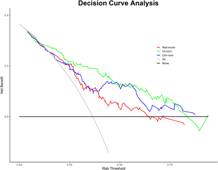
Figure 6.

Decision curve analysis (DCA) derived from the validation cohort. The y‐axis measures the net benefit. The net benefit is determined by calculating the difference between the expected benefit and the expected harm associated with each proposed model [net benefit = true positive rate − (false positive rate × weighting factor), weighting factor = threshold probability/(1 − threshold probability)]. The gray line represents the assumption that all nodules were malignant (the treat‐all scheme). The black line represents the assumption that all nodules were benign (the treat‐none scheme). If the threshold probability was >10%, using the integrated nomogram (green line) to predict the presence of PCa added more benefit for patients than using the clinical nomogram (blue line). Int‐nom, integrated nomogram; Clin‐nom, clinical nomogram; Rad‐score, radiomics score. [Color figure can be viewed at wileyonlinelibrary.com]
