

The figures were published out of order. See here the correct figures and their captions.
Fig 1. Survey selection flowchart, describing the survey selection process, inclusion/exclusion criteria, and number of surveys at each selection stage.
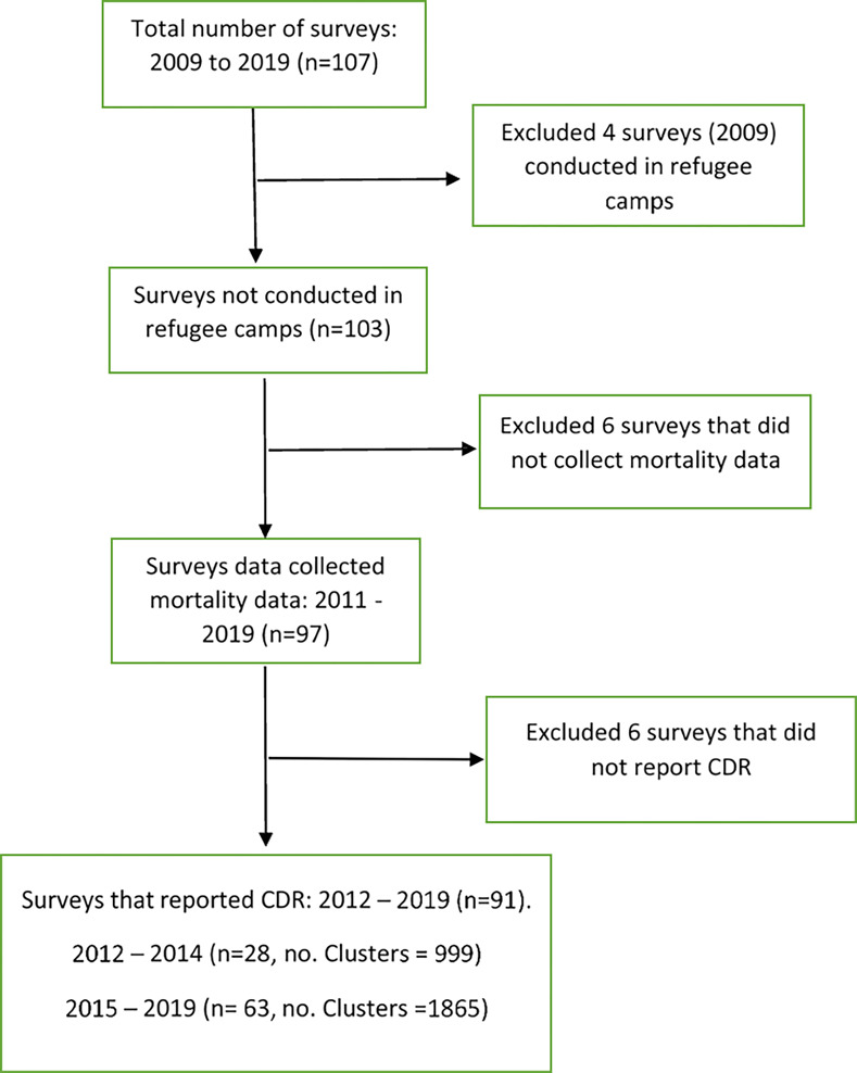
Fig 2. Geographical distribution of total excess deaths based on excess death rates by governorate, Yemen, 2015–2019.

Source: Shape files extracted from Global Administrative Areas (2012). GADM database of Global Administrative Areas, version 2.0. [online] URL: www.gadm.org. Created using QGIS version 3.10.3.
Fig 3. Geographic distribution of insecurity index levels, Yemen, 2015–2019.

Fig 4. Posterior crude death rate by governorate and insecurity level, Yemen, 2015–2019.

Fig 5. Humanitarian aid assistance to Yemen 2012–2019.
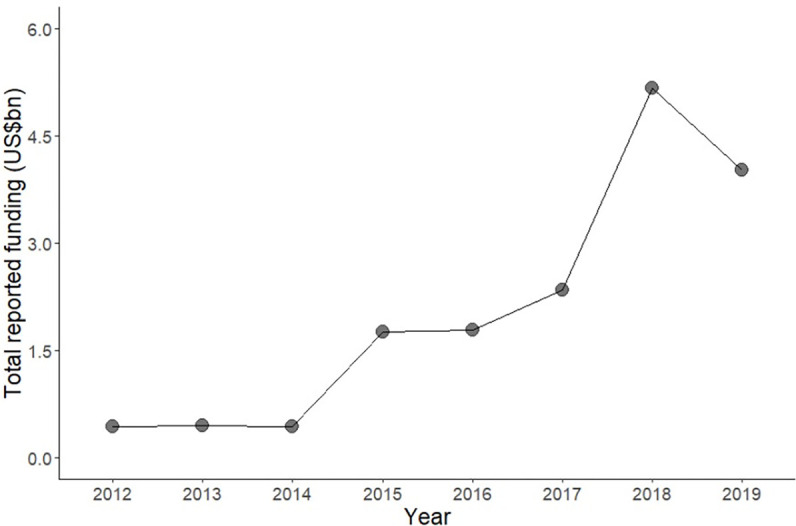
Data source: United Nations Office for the Coordination of Humanitarian Aid (UN-OCHA) [52].
Reference
- 1.Guha Sapir D, Ogbu JT, Scales SE, de Almeida MM, Donneau A-F, Diep A, et al. (2022) Civil war and death in Yemen: Analysis of SMART survey and ACLED data, 2012–2019. PLOS Glob Public Health 2(8): e0000581. 10.1371/journal.pgph.0000581 [DOI] [PMC free article] [PubMed] [Google Scholar]